Group sessions in nature often begin a little louder than anyone planned. People arrive, look around for where to stand, start side conversations, and a few restless bodies can quickly shape the mood. Even with a solid plan, the setting can either support focus—or scatter it.
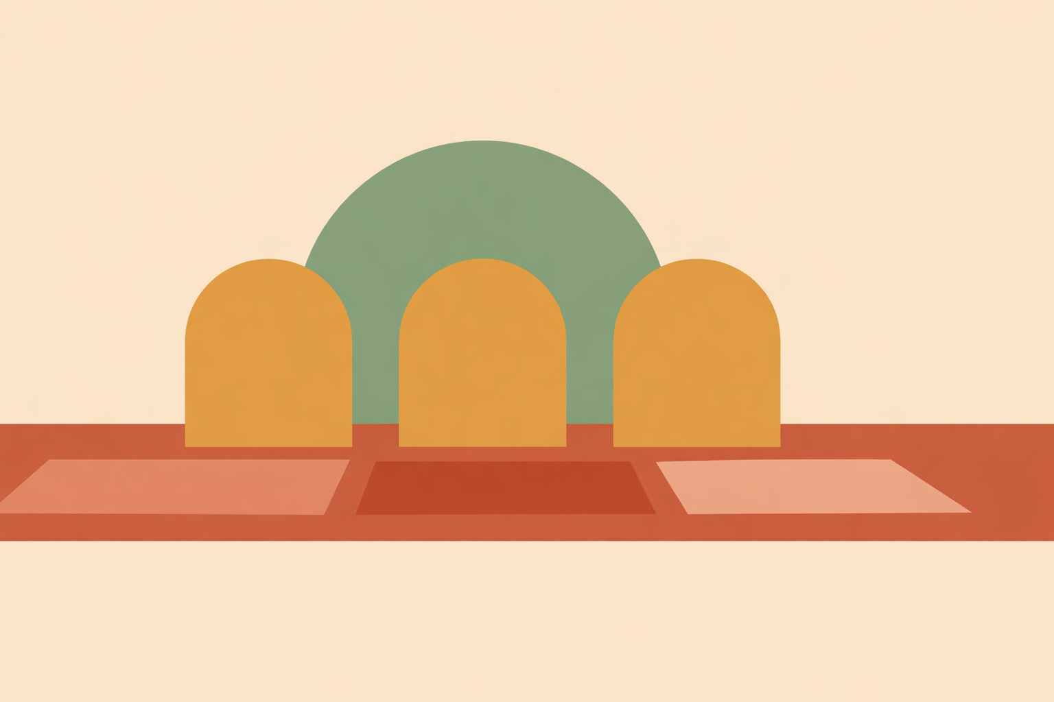
One of the simplest tools a facilitator can use is color: in signage, seating markers, shade cloths, baskets, blankets, and even what you wear. When color choices are accidental, the space can feel visually “busy” and harder to settle into.
Used with intention, color helps a group land, orient, and move through an outdoor session with less friction. Think of it as building a clearer container in a place where light shifts, backgrounds compete, and attention naturally roams.
Key Takeaway: Intentional color choices can reduce visual noise outdoors so groups orient faster and follow cues with less verbal direction. Ground your setup in the landscape, lower unnecessary contrast, use one focal color consistently, and shift warm-to-cool tones across zones to support arrival, teaching, and reflection.
Start with a base palette that belongs in the landscape
Let the place lead. Before you choose mats, markers, cloths, handouts, or layers, take in the dominant tones already present: forest greens, bark browns, stone greys, muted sand, dry grass, water blues, or seasonal earth tones.
When your setup looks like it belongs in the local biome, people tend to settle faster. Without a word, the space communicates, “you’re in the right place.” That’s especially supportive at the beginning, when participants are still scanning for cues about what’s happening and how to join in.
A steady base palette is usually:
- Muted rather than highly saturated
- Drawn from 2 to 4 tones already present in the setting
- Consistent across larger items like blankets, signs, baskets, and seating markers
- Quiet enough to let people notice your focal cues when they appear
This doesn’t mean everything has to fade into the background. It simply means the “background layer” of your session feels grounded rather than visually demanding. Outdoors, steadiness usually supports people more than novelty does.
Reduce visual stimulation before you try to direct attention
It’s common to try to gather a group by adding more signals: brighter props, more signs, more objects. Often, the more skillful first step is subtraction.
Nature itself is often linked with lower stress and better attentional recovery. Your setup works best when it supports that quality rather than competing with it. If everything is bright and high-contrast, the eyes don’t know where to rest—and neither does the group.
Contrast and saturation do a lot of the heavy lifting here. Color psychology has long connected warm colors with arousal and cool colors with calmer emotional tones. Essentially, louder colors tend to “activate,” while softened tones tend to soothe.
In the field, reducing stimulation can look like:
- Choosing dusty, softened versions of colors instead of neon or highly vivid ones
- Limiting bold contrast to the items that truly need to be seen quickly
- Avoiding patterned fabrics when a solid color will do
- Keeping repeated objects in one color family rather than mixing many unrelated tones
Here’s why that matters: when a group arrives energized, a calmer visual field gives you room to guide them. If everything is already “shouting,” nothing can lead.
Use one focal color to gather the group
Once the space feels quieter, a single, intentional focal color becomes surprisingly powerful. This is the color that wordlessly says, “look here now.” It might be on a scarf tied to a central branch, a talking piece, a ground marker, a flip pad, or the item you hold when giving instructions.
The aim isn’t complexity—it’s consistency.
When the same color repeatedly marks the point of orientation, people learn the cue quickly. Over time, that one color starts doing some of the organizing for you, so you rely less on repeating directions or pushing your voice.
To keep it effective, make your focal color:
- Distinct from your base palette
- Limited to one main function
- Visible from different angles and distances
- Used sparingly enough that it keeps its meaning
If your whole setup contains multiple “special” colors, the signal gets muddy. One clear anchor is usually enough.
Shape group energy with warm-to-cool color transitions
Color can also help guide the arc of a session across space. If you have different zones—even loosely defined ones—color transitions can suggest a shift in pace or mood before you say anything at all, much like a forest therapy walk moves people through distinct phases.
A practical way to work is warm-to-cool. Warm tones are commonly associated with activation and social engagement, while cool tones lean toward calm and reflection. Research has connected cooler tones with calmer emotions, which aligns with what many facilitators observe through lived practice and tradition.
This isn’t about “good” and “bad” colors—just using the right tool for the moment.
For example:
- An arrival point might include a touch of warm color to help orient and welcome
- A group teaching area might use balanced neutrals with one clear focal marker
- A reflection or closing area might lean into cooler, softer tones
Put simply, these gentle shifts can support stages like arrival, settling, and reflection. The group feels the change in their body and attention—even before it’s named.
Make your own presence visually coherent
The facilitator is part of the landscape. What you wear, carry, and place on the ground either adds clarity—or adds another layer to decode.
When your attire and materials share one visual language, your presence becomes easier to read. That’s especially helpful outdoors, where the background is already richly detailed.
Coherence doesn’t require a uniform. It’s a handful of deliberate choices:
- Wear colors that relate to your base palette
- Reserve your focal color for one item if you want your role or cueing function to stand out
- Match handouts, signs, cloths, and simple tools within the same family of tones
- Avoid introducing unrelated bright colors unless they serve a clear purpose
This is one of the easiest upgrades because it starts before anyone arrives. A small, pre-planned kit almost always creates more calm than last-minute assembling.
A simple five-move color method for outdoor facilitation
If you want something repeatable, keep it to five moves:
- Choose a grounding base palette drawn from the local landscape
- Reduce unnecessary contrast and high saturation
- Select one focal color to direct attention
- Use warm-to-cool shifts between zones where appropriate
- Keep your clothing and materials visually consistent
Together, these steps help create a steadier container outdoors, similar to how sylvotherapy sessions benefit from clear framing and supportive pacing. They support attention with fewer verbal interruptions, and they help the group feel guided by the space itself.
In closing, remember that color is always contextual. Culture, age, weather, landscape, and group composition shape how it’s received, and traditional knowledge—paired with close observation—remains a trustworthy guide. Aim for skillful choices, not rigid rules.
Published June 18, 2026
Train in Sylvotherapy Facilitation
Build nature-based session skills with the Sylvotherapy Practitioner Certification, aligning space, cues, and group flow outdoors.
Explore Sylvotherapy Certification →