Rhino 3D has grown into a steady, elegant way to translate meaning-filled product ideas into clear, color-faithful visuals clients can actually respond to. In 2026, it supports both intuitive making and brand-ready delivery—especially for designers shaping ritual objects, vessels, accessories, and packaging with care.
At the heart of Rhino is NURBS-based modeling, built on NURBS (Non-Uniform Rational B-Splines). Practically, that means smooth, organic shapes can still be controlled with real precision—so the “hand” of the object doesn’t get lost in the software. It’s also why teams use Rhino for first visualizations: early, trustworthy color and form help conversations settle into clarity.
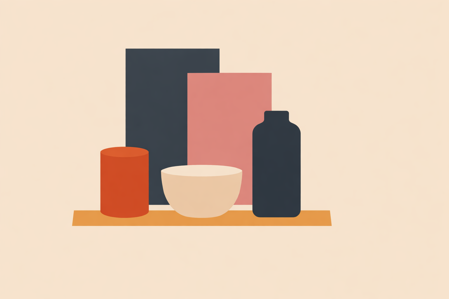
When an offering carries lineage—herb tools, altarware, scent diffusers—its visuals should carry that dignity too. Rhino 8 makes it easier to show proportion, material character, and finish in a way that honors craft while still communicating cleanly in modern channels.
Key Takeaway: Rhino 8’s strength in 2026 is pairing disciplined layer-based color structure with fast, believable visualization so clients can understand proportion, material feeling, and intent early. When your palette, contrast, and exports stay consistent across screens and print, feedback shifts from taste to clear decisions.
Why color‑true 3D visuals matter in 2026
Color‑true 3D visuals help clients “feel” an object before it exists. Even when screens vary, a disciplined color approach keeps your brand and your offering aligned—so the experience stays consistent, not just the pixels.
Once you need to show how something will actually look in space, mood boards can only take you so far. Rhino is often used to test form, finish, and palette in context, and you can see this in real product examples across shoes, packaging, and consumer goods. That speed matters: first visualizations move feedback from “I like it / I don’t” into decisions about proportion, material, and meaning.
Color only helps if people can read it quickly. For clarity, presentation guidance recommends high‑contrast combinations, and accessibility guidance points to a 4.5:1 contrast ratio for legibility—useful whether you’re sharing stills on a phone or slides in a workshop.
And yes, devices will still vary. Designers regularly notice color shifts between screens, and product photo workflows emphasize color consistency to reduce surprises. The goal isn’t perfect sameness—it’s a visual story clients can trust.
Meeting Rhino 3D as a design ally
Rhino becomes easier the moment you treat it like a drawing companion rather than a machine. It’s a natural fit for small studios and makers who want to sketch, sculpt, and refine concepts without getting buried in complexity. Many beginners find Rhino’s interface easy to learn, especially when they come from a sketchbook-first background.
It’s also widely known for powerful modeling across product, jewelry, and accessories—without forcing you into a rigid way of thinking. One reviewer put it plainly: “Rhino is not a hard to learn software… it is actually a very easy software to start with.” (easy to start). Another called it “the best software for design and quick production of data” (quick production). Educators often describe Rhino as a balanced “middle path” that stays powerful modeling as your work grows.
Essentially, Rhino rewards a grounded rhythm: block in volumes, read the form under simple light, then layer color with intention. That’s a natural match for work shaped by tradition—where meaning is carried through proportion, material choices, and careful restraint.
Color structure in Rhino 3D for clear client stories
Color reads best when it has structure. With layers, object properties, and display modes, Rhino lets you “paint with logic,” so clients understand your intent at a glance.
Start with layers as a consistent code. Clear layer hierarchies let categories carry assigned colors, line types, and print widths—turning complexity into a readable map. When you need nuance, per‑object overrides add variation without breaking the system.
“Rhino’s most client‑friendly color workflow starts in the viewport: use custom display modes, disciplined lighting, and consistent layer palettes to make systems legible fast.”
Visualization expert Thalia Ross emphasizes a diagram-friendly Artistic display: “white background, gentle ambient shadow, and a clean line hierarchy where silhouettes carry the structure and inner edges stay quiet.” (Artistic display).
For palettes, lean on the 60–30–10 rule and avoid vibrating combinations like saturated red–green. Put simply: a clear hierarchy (core hue, supporting hue, accent) lets clients focus on purpose and symbolism instead of decoding your choices.
From vague brief to soulful 3D form in Rhino 8
Rhino 8 is well-suited to bridge the gap between a felt idea and a convincing colored form. The flow begins loose and expressive, then tightens as decisions become client-visible.
First, sketch in 3D without over-policing yourself. Rhino’s free‑form tools support quick volumes and gestural surfaces—ideal when you’re still discovering the object. For practical habits like protecting proportion, simplifying light, and shaping “readable” silhouettes, this Rhino sketching guide helps turn ambiguity into aligned shape language.
Then bring in refinement. SubD Creases help you create clean transitions without losing softness, and updated PushPull workflows let you nudge volumes quickly while you’re still listening for the form’s “voice.” When you need a printable mockup, ShrinkWrap can convert expressive surfaces into closed meshes suitable for 3D printing.
“Other thing I find good is looking at real life objects and draw on paper… it helps to have a 3D view of objects.”
This learner reflection on real‑life observation echoes a time-tested maker’s rhythm: study a vessel in the hand, then shape its sibling in the viewport. That back-and-forth is often where the “soul” of an object becomes visible.
Rendering client‑ready color in Rhino 3D (2026)
Rendering is where proportion meets atmosphere. With today’s tools, you can keep your viewport discipline and carry it into believable light without turning the process into a technical marathon.
Rhino’s built‑in rendering has become faster and more capable, which makes it useful for early feedback loops. When you need more material nuance, Rhino pairs well with V‑Ray and Cycles for more precise reflections, refractions, and color fidelity.
This approach is well-established in detail-sensitive fields. Jewelry designers often rely on photorealistic rendering to help clients evaluate gemstone and metal finishes before committing. For herb tools, spoons, incense accessories, and similar objects, the same clarity helps clients sense sheen, finish, and scale before anything is produced.
When it’s time to share beyond stills, Rhino 8 includes USD export and glTF import/export for web viewers. For cleaner technical storytelling, Rhino’s sectioning tools can generate readable slices and hatches straight from your 3D studies.
“When clients can grasp proportion and fit early, conversations naturally shift toward meaning, priorities, and stewardship.”
As Thalia Ross notes (proportion and fit), this is the real win: once the basics are clear, you get to spend time on values, narrative, and responsible choices—not constant rework.
Keeping Rhino colors consistent across screens and print
Perfect color matching across every device isn’t realistic. The more useful goal is consistency of feeling—and a few grounded habits make that much easier to achieve.
Monitors differ for several reasons, including three causes many designers run into again and again. Product image specialists also emphasize that calibrated monitors and controlled color spaces reduce unwanted surprises.
Here’s a light-touch workflow that holds up in real projects:
- Choose standardized color spaces early and stay consistent.
- Keep a small set of brand swatches and export presets so your settings don’t drift.
- When text sits on color, aim for 4.5:1 contrast for legibility.
- Preview on common devices to catch obvious color shifts before sharing.
For collaboration and handoffs, Rhino’s openNURBS ecosystem helps preserve your layer-color logic across workflows. Absolute sameness isn’t the bar; coherence is. If the object feels like itself—from phone to print to prototype—your color system is doing its work.
AI, Grasshopper, and parametric color as design rituals
Systems can support intuition without replacing it. Grasshopper and AI-adjacent workflows are most useful as disciplined ways to ask “what if?”—while you keep authorship over meaning, symbolism, and form.
Grasshopper brings parametric control into Rhino, meaning proportions, patterns, and even color behavior can respond to rules in real time. In that sense, Rhino empowers designers to iterate quickly without losing structure. Think of it like a living lab: experiment with Grasshopper so tone shifts by size, accents trigger with curvature, or materials swap by category—whatever best supports the story your object is meant to carry.
On the visualization side, newer pipelines connect Rhino workflows to generative tools for building scenes that blend procedural geometry and AI imagery. The Rhino team highlights integrations with AI tools like Blender and ComfyUI, alongside the Emergent Futures workshop exploring concept-driven 3D. If your ideas begin in symbol, ritual, or landscape, these tools can help you build context around a color-true object without diluting its center.
When you need to move toward touchable artifacts, Rhino’s ecosystem supports that too. RhinoCAM’s 2026 ART module can translate 2D artwork into 3D reliefs for machining or printing, and Rhino supports animations for motion-based teaching assets. The point isn’t automation—it’s harmony: letting systems extend your hand while your values remain the compass.
Building a living library of Rhino 3D product visuals
Rather than creating one-off renders, it’s often more sustainable to build a living library: a color-consistent archive of objects, scenes, and diagrams that grows alongside your work.
Rhino layers can mirror how an object is meant to be experienced—zones, flows, materials—so your model becomes a map of intent. This “system-first” approach is described in our post on layer systems, and it turns one model into many client-ready assets: hero stills, assembly diagrams, workshop slides, and social snippets.
For families of offerings that share a common DNA, parametric rules can keep form and color evolving together. Because Rhino supports product and jewelry workflows as well as packaging and interior elements, one “backbone” model can seed an ecosystem—updated once, expressed many times. With procedural setups and animation support, your teaching visuals can evolve as naturally as your offerings do.
Across disciplines, Rhino is still regularly described as powerful modeling for idea-to-visual workflows. In the Naturalistico spirit, the goal is warm, legible visuals that support real client conversations—and keep improving as your community grows.
Bringing Rhino 3D and client‑ready color into your practice
The rhythm stays simple: sketch the form, structure the color, share it in believable light, then keep your library alive. Done consistently, Rhino becomes a dependable ally for client-ready color in 2026—especially when your work carries cultural or ancestral threads.
If you’re new, focus on what matters most for real client work: viewport discipline, layer color logic, and a light rendering setup. Rhino’s learning resources help you get oriented, and many designers find Rhino creates a competitive edge in design-forward fields.
To close with one grounded caution: color will always shift a little across screens and print, and every workflow benefits from testing and calibration when possible. But with clear structure and thoughtful presentation, you can reliably communicate what matters—form, intention, and material feeling—so clients can say “yes” with confidence.
Published April 24, 2026
Go further with Rhino color
Apply these Rhino workflow habits in the Drawing course : Rhino 3D and Color.
Explore Rhino 3D and Color →