

Many designers try to make work feel “organic” with symmetry, leaf textures, or decorative spirals. When the underlying layout is unclear, those choices can read as stiff or crowded. A stronger foundation often comes from structure first, ornament second.
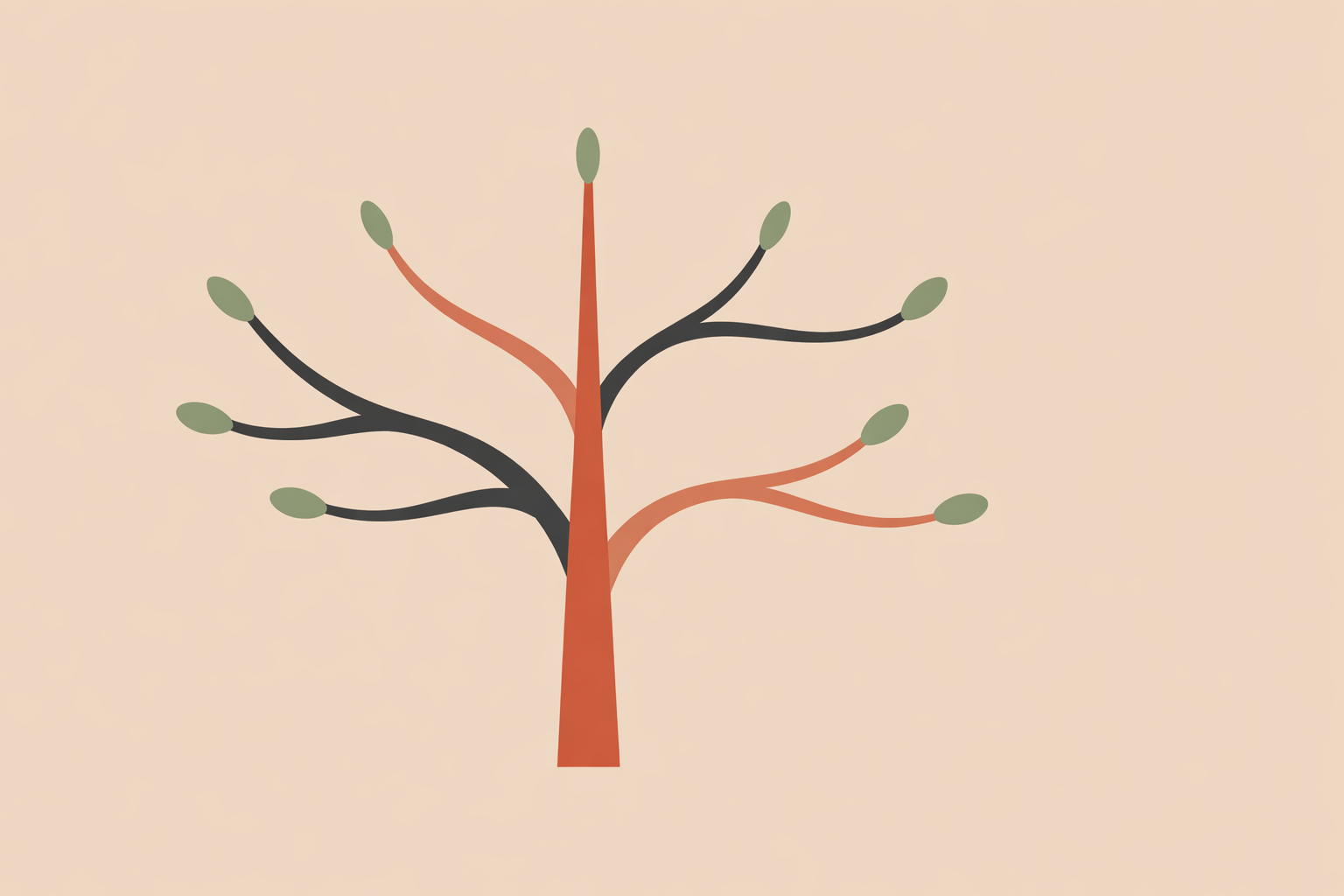
Natural branching offers a clear structure: a main line, a few confident offshoots, and visible taper. The eye understands the pathway immediately because living forms commonly move from larger channels into finer ones, with hierarchy and breathing room built in.
Key Takeaway: Natural branching is a simple composition armature that helps artwork feel both structured and alive. Start by observing one real branching system closely. Then translate it into a lean skeleton with a main axis, a few primary divisions, and clear taper. From there, use simple rules for hierarchy, spacing, and variation, place the structure inside larger geometry when helpful, and adapt complexity to the final format. The strongest results come from balancing clear visual order with enough irregularity to keep the work feeling living and human.
Step 1: Train your eye on real branching patterns
Begin with direct observation: one tree, one root system, one river fork, or one leaf vein. One well-studied example will teach you more than a large collection of borrowed motifs.
Spend long enough with it to see its true behavior. Real branching is responsive: light, gravity, wind, crowding, damage, and age all leave traces, and those traces are often what make a structure feel believable.
A simple field exercise:
- Choose one specimen: tree, root, vein, or stream confluence.
- Mark the main axis first.
- Note where the first major split happens.
- Count the largest divisions before looking at smaller ones.
- Compare widths between parent and child branches.
- Notice typical angle ranges rather than exact repeated angles.
- Identify where the system leaves open space.
- Notice any breaks in pattern caused by pressure, damage, or obstruction.
This kind of looking trains rhythm and proportion together. You start noticing relationships: how far a branch travels before it divides, how taper is distributed, and how asymmetry gives character.
Traditional visual lineages can be studied the same way. If temple woodwork, manuscript ornament, or historical diagrams shape your style, name the tradition in your own notes and keep track of what you’re borrowing. Specificity tends to deepen the work and strengthens respect.
Step 2: Build a clear composition armature
After observing a living example, simplify it into a skeleton. Skip the twigs at first and commit to the main structure.
Your armature only needs three levels:
- one main trunk or axis
- two or three primary branches
- a small number of secondary supports
If the skeleton reads, details become supportive rather than distracting.
A practical sequence:
- Choose the trunk. Draw one confident directional line.
- Place the primaries. Add the main offshoots where the real system first divided.
- Add secondaries sparingly. Use them to support rhythm, not to fill every gap.
- Apply taper. Let each generation become thinner and usually shorter.
- Stop before it gets busy. If it already reads, protect that readability.
Perception research supports what many artists learn through practice: tree imagery stays recognizable when it keeps branch-thickness scaling. Proportion does a lot of the lifelike work.
The observation often associated with Leonardo da Vinci can also guide sketch decisions: the cross-sectional area above a split tends to relate to what’s below it. No calculations needed; it’s enough to remember that thickness is “redistributed” through the branches in a consistent way.
Digital or analogue, the visual logic stays steady. A thicker trunk leading to slightly thinner primaries, then thinner secondaries, reads as natural because the eye expects that flow.
Step 3: Use simple rules for hierarchy, taper, and rhythm
Once the armature is down, a few light rules keep it coherent while you improvise. Structure gives you a stable base; variation keeps it feeling human.
Try a simple branching rule set:
- Start with one trunk line.
- Split into two children within a modest angle range.
- Reduce length and thickness each generation by a similar ratio.
- Limit the number of generations.
- Leave intentional negative space.
This establishes hierarchy fast. The viewer can see where the form begins, where it expands, and where it softens into fine detail.
Then add the kind of irregularity living systems always have. Let one split happen later, let one branch travel farther, or reserve one clear gap. If everything is evenly spaced and evenly weighted, the image starts to feel mechanical.
For posters or prints, a practical setup might be:
- maximum generations: 3
- angle range: 20° to 35°
- taper per generation: around two-thirds
- one preserved gap per quadrant: one preserved gap per quadrant
Parameters like these make it easier to stay consistent while still drawing freely.
Step 4: Combine branching with symmetry, spirals, and proportion
Branching becomes especially compelling when it sits inside a larger geometric container. In sacred-geometry work and sacred geometry certification contexts, that pairing can feel natural because it balances living movement with clear order.
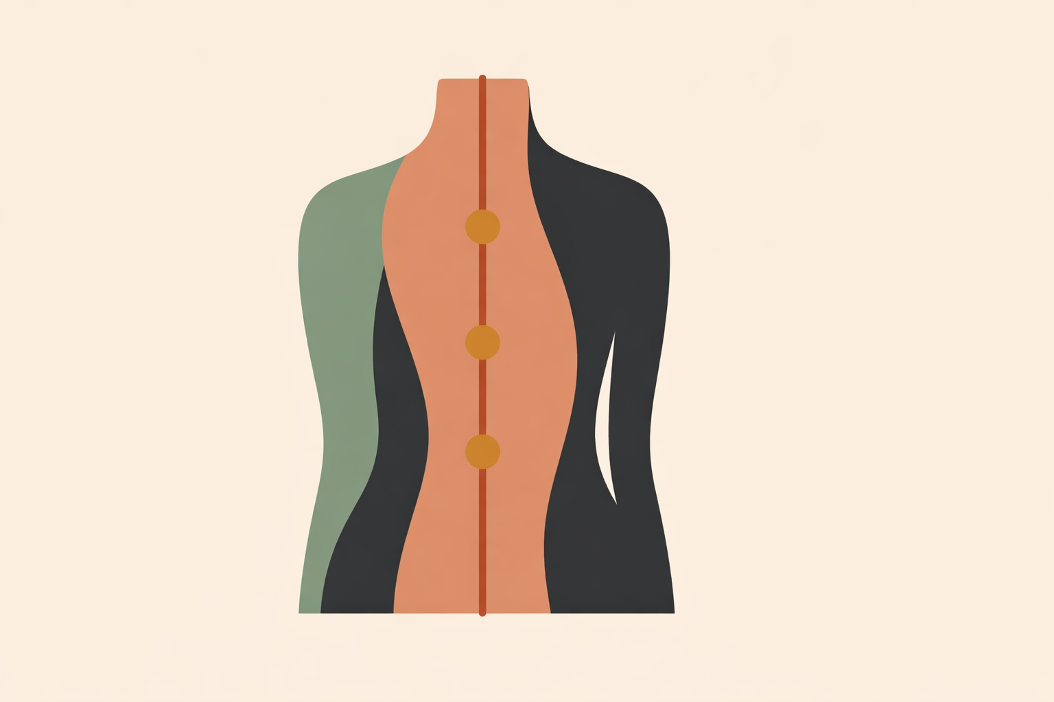
Bilateral symmetry suits emblems, gateways, and wing-like forms. Mirroring offers stability, and small asymmetries keep the image from feeling frozen.
Radial symmetry works well for circles. A central source acts like a trunk origin, and outward branches can gradually become more varied as they travel.
Rule-of-thirds placement is also useful. A main junction placed off-center often reads as more dynamic than one placed dead center.
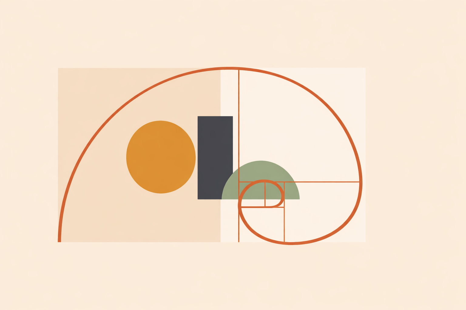
Spirals and proportion systems can support branching too. Keep them subordinate so they function as a scaffold rather than a competing decoration.
A reliable principle is to choose one dominant system and one supporting system. Let branching lead while geometry supports, or let geometry lead while branching animates.
Step 5: Adapt branching for logos, screens, textiles, and large-scale work
Branching works across scales, but the density needs to match the format. A design that sings on a poster can collapse in an avatar.
Logos and avatars. Reduce to the trunk and the most meaningful splits. At small sizes, silhouette carries the whole idea.
Posters and mobile screens. Keep moderate branching and generous negative space. Too many fine endpoints merge quickly on screens.
Murals and large prints. Add more visible divisions for close viewing, but make sure the overall silhouette still reads at a distance.
Textiles and repeat patterns. Prioritize rhythm and spacing so repetition feels breathable rather than crowded.
Digital and interactive visuals. Bounded randomness in angle, taper, and density often creates a more lifelike sense of growth than perfectly repeated curves.
A dependable workflow: build the armature, test it at the smallest likely viewing size, simplify what collapses, then add detail for closer viewing. Readability comes first, and complexity earns its place.
Step 6: Hold symbolism, culture, and personal meaning with care
In spirituality and ritual contexts, branching often carries meaning beyond composition. That layer can be powerful when it’s held with clarity and respect.
A useful approach is two-layer language: observation first, interpretation second.
- Observation: this image uses a three-generation branching rule, visible taper, and a left-leaning trunk.
- Interpretation: some people experience branch-like forms as symbols of pathways, kinship, or unfolding choices.
This keeps the visual facts grounded while leaving room for personal reflection, without turning symbolism into a promise.
The same care applies culturally. If a motif comes from a specific lineage, name it where relevant and avoid blending distinct traditions into a vague “ancient” aesthetic. Respect grows through specificity, credit, and a willingness to adjust.
When guiding others through reflective art-making, use choice-rich language. Invite meaning rather than assigning it, and offer prompts without pressure.
Conclusion: Turning branching patterns into stronger designs
Working with branching is a practice of attention: observe a living structure, reduce it to a clear hierarchy, and rebuild it in service of the piece. Done well, the result feels grounded and spacious—organized enough to guide the eye, varied enough to feel alive.
A compact checklist:
- Main direction: what is the trunk’s lean or visual vector?
- Primary structure: where do the biggest splits happen?
- Taper: do child branches clearly reduce in weight?
- Spacing: where are the open gaps?
- Hierarchy: do the largest forms read first?
- Variation: is there enough irregularity to avoid stiffness?
- Scale: does the design still read at its smallest use?
- Meaning: is interpretation offered carefully and respectfully?
Branching patterns continue to matter because they unite visual order with lived irregularity. Work built from that foundation tends to carry clearer rhythm, stronger coherence, and a more natural sense of presence.
Explore Sacred Geometry Certification
Apply branching, symmetry, and proportion principles more deliberately in the Sacred Geometry Certification course.
Explore Sacred Geometry →