

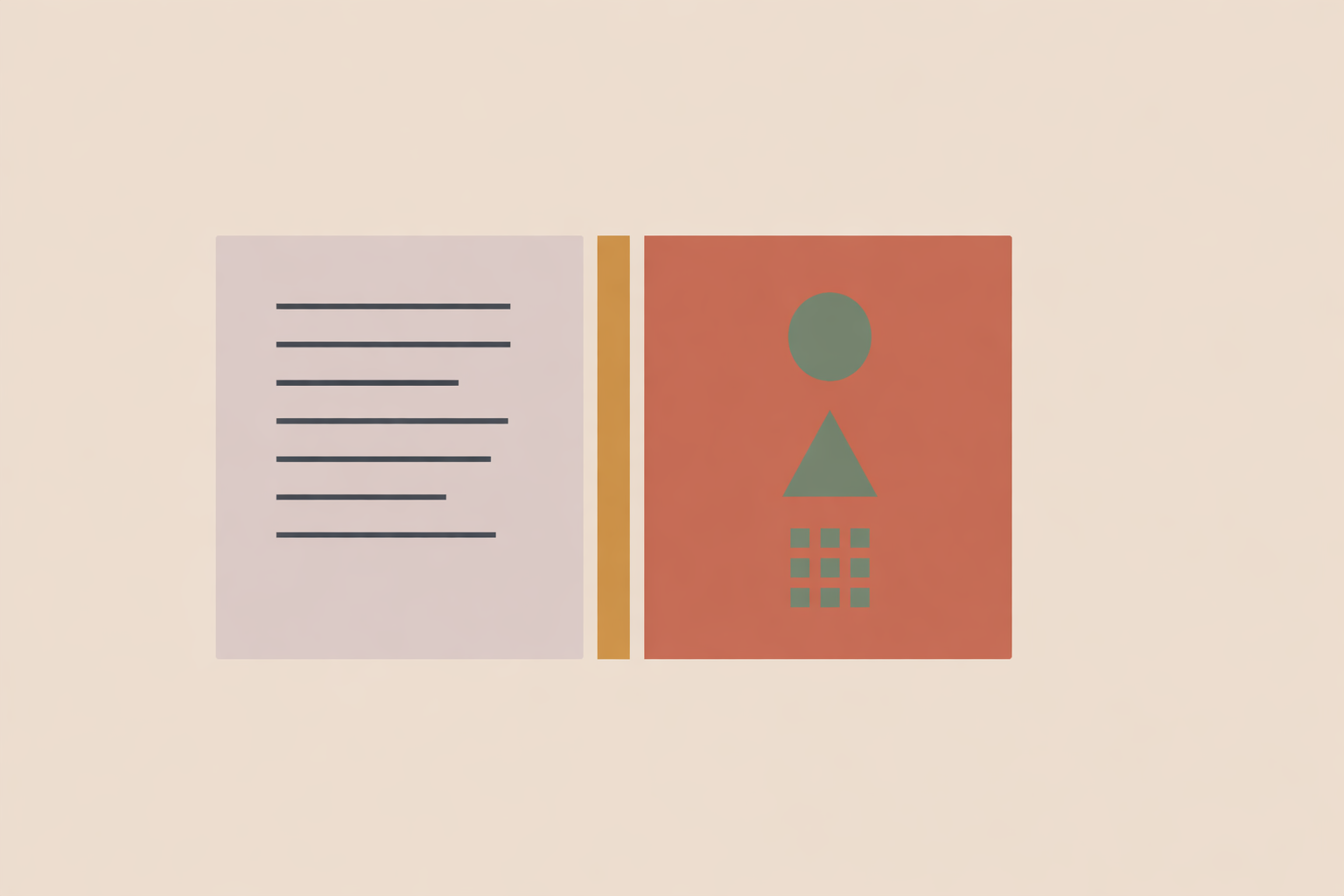
Practitioners often bring geometry into agreements for good reasons: it adds care, creates order, and makes a functional document feel more considered. The difficulty comes when symbols begin doing work that only clear sentences should do. Clients may infer promises from icons, skip essential terms, or read visual cues as commitments they never explicitly agreed to.
A steadier approach is to use geometry as a supporting language rather than a substitute for plain text. Let the sentences carry boundaries, fees, privacy, communication, and endings. Let shapes support orientation, emphasis, and optional reflection. When those roles stay distinct, the document remains clear, usable, and aligned with informed choice.
Key Takeaway: Geometry in client agreements should support clarity, not replace it. The strongest approach is simple: keep all essential terms in plain language, use only a small and consistent icon legend, and make every visual element clearly supportive rather than contractual. Grids, mirrored layouts, decision maps, progress markers, and optional reflection pages can all improve flow when they guide attention without implying promises or outcomes.
Start with a plain-language baseline
Before adding any visual elements, make sure every essential term stands up in plain language. If the writing is unclear, design can only decorate the confusion.
A quick test helps: could a thoughtful teenager explain the agreement back to you in everyday words?
- What you offer
- What is outside scope
- Session length and scheduling
- Fees and payment timing
- Rescheduling and cancellation
- Privacy and record handling
- Communication channels and expected response times
- How either person can end the work
For example:
“Package A: 6 sessions over 12 weeks, €780 total. Pay in full at booking or in 3 monthly payments of €260. No hidden fees.”
Near the top, add one sentence that protects the boundary between visual design and contractual meaning:
“The shapes and visual elements in this document are included to support reflection and navigation. They are symbolic design choices, not additional terms, guarantees, instructions, or evidence of an outcome.”
Keep your icon legend small and consistent
The more meanings you assign to symbols, the more mental work you ask of the reader. A lean, consistent legend is kinder and clearer.
Three icons are usually enough:
- Square (■) for boundaries and logistics
- Triangle (▲) for changes or decisions
- Circle (●) for wellbeing and optional reflection
Place the legend in a quiet header or margin and explain it in one sentence: “Icons help you spot sections; they do not add terms.”
You can also reassure the reader: “You can ignore icons if you prefer. Everything you need is written in full sentences.”
This keeps the visual system supportive, and it reduces the risk that an icon is mistaken for a clause or an implied promise.
Use layout to guide attention
Good agreement design is mostly structure. Geometry earns its place when it reduces friction and makes the page easier to move through.
You don’t need a rigid formula. Aim for a consistent rhythm: a clear text area for full terms, a secondary space for short supports, and enough whitespace for calm readability.
A practical arrangement might look like this:
- Main column for the full terms
- Side column for icons, short summaries, or contact details
- Consistent spacing between sections
- One strong heading per topic
The payoff is straightforward: clients can find what they need faster, and the agreement feels steadier to read.
Mirror shared responsibilities carefully
If your agreement includes mutual responsibilities, symmetry can communicate partnership. Many traditional lineages place value on balance and reciprocity, and a mirrored layout can quietly reflect that principle without adding any extra “meaning” to the terms.
That could look like this:
- What I’ll hold: punctuality, clear facilitation, clear next steps
- What you’ll hold: punctuality, honest communication, agreed preparation or follow-through
Keep the tone and weight genuinely even. The goal is a shared container that feels fair, not a decorative performance of equality.
Map decisions instead of burying them in dense paragraphs
Conditional policies like rescheduling or cancellation are easier to follow when readers can see the path that fits their situation.
For example, under a rescheduling section:
- If more than 24 hours remain → Use the booking link → Choose a new slot → No fee
- If less than 24 hours remain → Email me → We’ll choose the next best option → One session deducted
This branching format helps people locate the relevant rule quickly, especially when timing changes the outcome.
Add one collaborative line: “If you’re unsure which path fits, choose the closest option and we’ll clarify it together.”
Use tiles and section blocks for complex offers
If you offer multiple formats, tiles can summarize options neatly without crowding the agreement. Keep each tile informational rather than persuasive.
For instance, you might use a simple grid for:
- 1:1 Sessions
- Group Circles
- Retreat Day
- Custom Project
Each block can include a short description and a concise “Includes” line, while the full terms remain in standard paragraphs elsewhere.
For accessibility, give each tile a clear text label. Visual styling alone should never be the only signal.
Make progress and sequence visible
Some agreements become easier to follow when the reader can see the sequence. Step markers make timing and process feel concrete, especially during onboarding.
For example:
- Inquiry
- Fit Call
- Agreement
- First Session
- Midpoint Review
- Closure
Filled circles can show the current step, while outlined circles show what comes next. This works well in digital flows where it’s easy to lose your place.
A short line beneath the steps preserves choice: “You can pause between steps; please tell me what you need.”
Keep optional reflection clearly optional
If reflection is part of your work, it can sit alongside an agreement in a respectful way when it’s clearly separate and genuinely optional.
For example:
- Header: “Optional reflection you may skip”
- Prompt: “Mark where you are today, or leave blank if you prefer”
- Clarifier: “If you share this, I’ll receive it as context, not instruction”
This is especially important with circular, radial, or mandala-like forms. These shapes can support self-awareness, but they should never create pressure to disclose or “perform” insight.
If you draw inspiration from a living tradition, name it carefully and consider whether it belongs in an agreement at all. A neutral radial diagram is often the more respectful choice.
Separate symbolism from promises
When you use a meaningful symbol, state its job in the document. A single clarifying line prevents overinterpretation.
For example:
“We use a triangle here as a symbol of movement. It is a visual cue only.”
That one sentence keeps symbolism honest and ensures people are consenting to words, not impressions.
Use microcopy that protects agency
Small lines of supportive text can change how safe and clear the agreement feels. Good microcopy reduces pressure and keeps choice visible.
- “Skim or read closely; both are okay. The bold lines cover essentials.”
- “Icons are for wayfinding; the terms are in the sentences.”
- “You can ask for a pause, a break, or a different format.”
- “If something feels unclear, please ask before agreeing.”
This reinforces a shared responsibility for clarity, while still keeping boundaries firm.
Test the agreement with real readers
The fastest improvements come from seeing where real readers hesitate. A short clarity test often reveals what you can’t catch on your own.
Ask two peers and one non-practitioner to read the document, then ask:
- What are you agreeing to?
- How do you reschedule?
- What happens if you miss a session?
- How does privacy work?
- How can you end the process?
If more than one person misses a key point, revise the wording and move that point higher in the section. This keeps the agreement anchored in reader understanding rather than designer intention.
Rewrite formal language into everyday language
Agreements work best when they read like a clear adult conversation.
- Instead of: “Cancellation within twenty-four hours will incur a fee equivalent to 100% of the session price.”
- Write: “If you cancel with less than 24 hours’ notice, the full session fee applies.”
- Instead of: “The undersigned consents to be contacted via electronic mail.”
- Write: “I may email you about scheduling and resources.”
Plain language is professional. It also makes informed choice easier.
Build accessibility into the design
Accessibility is part of respect. If the agreement is hard to read, navigate, or hear, the design isn’t doing its job.
Useful practices include:
- Readable font sizes in print and on screen
- Strong contrast between text and background
- Clear headings and consistent spacing
- Alt text for icons and meaningful images
- A plain-text version alongside a styled PDF
- Short second-language summaries where relevant
If it supports the reader, offer to read the agreement aloud and pause for questions at any point.
Design digital agreements so terms stay visible
In online forms, it’s tempting to hide important details behind tabs or accordions. That design choice makes key terms easier to miss.
Use visual elements as navigation, while keeping the full wording visible and easy to reach. Tiles can jump to sections, and progress markers can show where someone is, but readers shouldn’t have to hunt for the actual terms.
This supports continuity and reduces the chance of someone clicking through without truly seeing the essentials.
Use change logs and signatures with restraint
If you update your agreement, add a brief “What changed” note near the top. Keep it factual.
For example:
“Updated 12 Sept: clarified the 24-hour rescheduling window; added the option to switch to phone if video fails.”
The signing area should be equally clean. Avoid surrounding signatures with decorative symbolism or emotionally loaded language.
A clear name/date line and one confirmation sentence is often enough:
“I’ve read and understood the terms above.”
If a reflective element appears nearby, label it as optional and keep it separate from the agreement text.
Be careful with cultural and symbolic references
Geometric forms carry different meanings across traditions. When you borrow from living cultural or spiritual lineages, context and consent matter within spirituality and ritual work.
If a motif is inspired by a specific tradition, say where it comes from and why it’s here. If you can’t explain it naturally, choose simpler abstract geometry.
Keep sacred or symbolically charged imagery away from pricing and payment sections. Even with good intentions, that pairing can feel uncomfortable or confusing.
A practical checklist for your next revision
- Are all essential terms clear in plain language?
- Do visuals support navigation rather than carry meaning on their own?
- Is the icon legend small, consistent, and explained?
- Are responsibilities, fees, privacy, and endings easy to find?
- Can conditional policies be shown more clearly as simple paths?
- Are any reflective elements fully optional?
- Are important terms visible in digital versions?
- Is the document accessible in format, contrast, structure, and wording?
- Have you tested it with real readers?
- Does the signature area stay plain and unpressured?
Geometry belongs in agreements when it serves clarity, care, and honest orientation. Shapes carry wayfinding, while the text carries commitments.
Keep that order intact and the design becomes a real support to understanding. The agreement reads more calmly, feels easier to navigate, and protects informed choice, with cautions and boundaries stated clearly where they belong.
Explore Sacred Geometry Certification
Apply clear, respectful symbolism with the Sacred Geometry Certification while keeping client terms explicit and consent-based.
Explore Sacred Geometry →