

Designers who work with sacred geometry often meet the same friction point: the golden ratio is celebrated as a doorway to harmony, yet real projects come with real constraints. Copy wraps awkwardly, side panels compete with focal imagery, accessibility needs reshape spacing, and symbolic meaning doesn’t always land as visual clarity.
A steadier approach is to keep the harmony and drop the absolutism. Phi works best as a practical starting point that you shape to content, context, and real people. Used that way, it adds structure, rhythm, and focus without overruling judgment.
Start with a simple 62/38 split, test a spiral for attention flow, build hierarchy with Fibonacci stepping, then adjust wherever readability, comfort, or tone ask for it.
Key Takeaway: The golden ratio works best as a flexible design guide, not a fixed formula. Start with simple proportions like 62/38, use spirals and grids to support focus and hierarchy, keep typography and spacing modest, and validate choices with real people rather than assuming phi is always best.
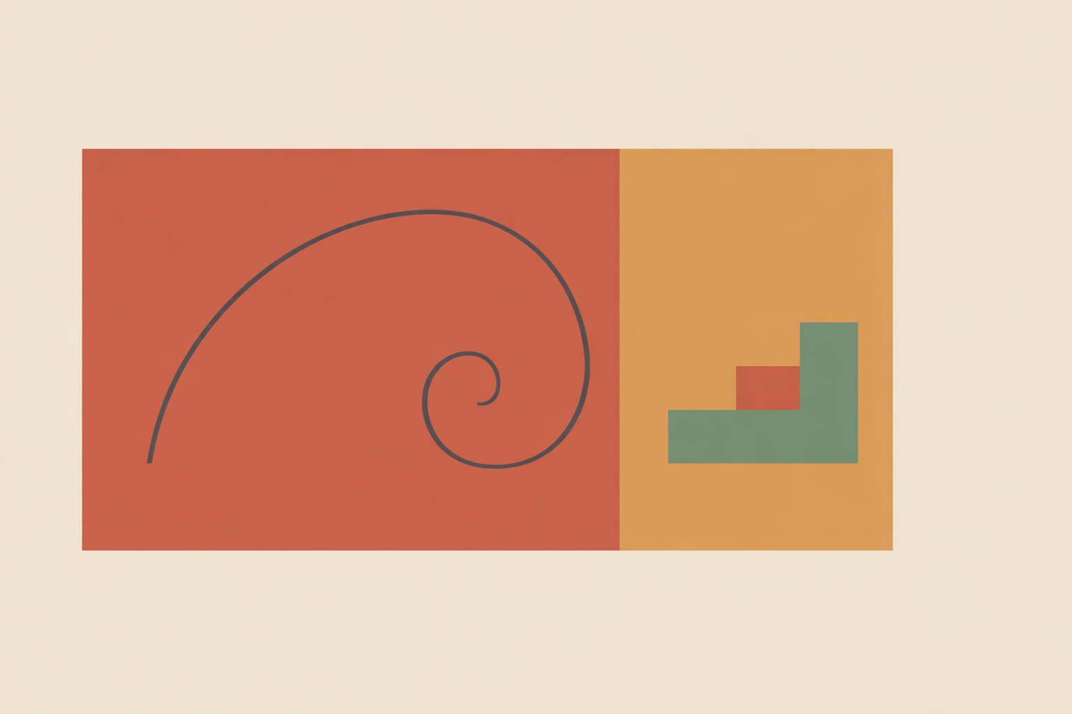
Start with a Golden Rectangle and a Practical Base Split
If you want phi to help, bring it in early. Starting with the outer frame establishes order before elements start competing for attention.
A golden rectangle uses a side relationship of about 1:1.618. From there, you can divide the frame into larger and smaller sections, a practical layout division used across editorials, landing pages, and presentation slides.
Often, that first split is enough. The main field can hold a headline, lead image, or core teaching point, while the smaller field carries captions, controls, notes, or secondary context.
This thinking shows up in physical spaces too: a rough 60/40 balance is often used to help a room feel composed rather than crowded or empty. Pages and screens respond similarly, because openness creates calm and hierarchy creates direction.
Mathematical exactness isn’t the goal. Start with a proportion that tends to feel composed, then refine based on the project. On a mandala-inspired poster, the smaller portion might become protected negative space for a dedication or a single reflective line, and the “emptiness” reads as intentional structure.
Use a Golden Spiral to Guide Attention
The golden spiral shines when your composition already contains movement. Curves, branches, waves, hands, and flowing lines respond well to spiral thinking because the eye is already being invited to travel.
The spiral gives you a clear path: broad movement on the outside, a quieter point of emphasis toward the center. Designers often use it to adjust placement so the composition feels gathered rather than scattered.
It’s especially helpful when a scene contains multiple arcs or directional cues. The spiral supports a confident choice about what matters most, and it helps everything else fall into a supportive role.
It also helps to keep language measured. Not every natural spiral matches phi exactly in its growth pattern. Sacred geometry still carries meaning here, with the spiral functioning as a symbolic and aesthetic guide.
A practical setup:
- Overlay a spiral that matches your canvas orientation.
- Place the main focal element near the inner curl.
- Let secondary elements follow the wider arc.
- Remove the overlay and fine-tune by eye.
In group or reflective settings, sensitivity matters as much as composition. A tight spiral center can feel intense for some people. Widening the coil or shifting emphasis outward usually restores ease while keeping the underlying logic.
Build a Grid That Clarifies Hierarchy
Golden-ratio thinking becomes especially useful in multi-part layouts. Articles, resource pages, handouts, and visual teaching materials all benefit when structure quietly supports scanning and emphasis.
Start with a large/small division, then repeat it where needed. This creates a dependable framework for columns, cards, captions, and side notes without making the page feel stiff.
Within that framework, Fibonacci stepping can add clear hierarchy. Using sizes like 3–5–8–13 units helps avoid the common issue where everything carries the same visual weight.
The goal is readable contrast. A feature block at 13 units, a supporting section at 8, and a small note or pull-quote at 5 often feels more alive than three equal blocks competing for attention.
For workshop handouts, this is very practical: use the larger column for steps, prompts, or teaching points, and the smaller one for reflections, journaling space, or key reminders. The layout supports movement and pause in a natural rhythm.
Use Phi Lightly in Typography and Spacing
Typography is where phi gets over-applied. Proportion can support rhythm, but text still needs to feel effortless to read.
In spacious, display-led layouts, a phi-based scale can create elegant contrast between body text and headings. In dense interfaces, course materials, or information-heavy pages, smaller ratios often read better. Many designers stick around 1.2 and 1.333 in product-style reading environments rather than jumping to 1.618.
Use phi here as a gentle influence. Explore it for display sizes, then pull back until the page feels steady.
The same applies to spacing. A common workshop heuristic is to take an element height, divide by 1.618, then halve that result for inner padding. It isn’t a law, but it often produces comfortable spacing around buttons, badges, and compact interface elements.
Readability comes first. If a heading feels overly dramatic, reduce it. If spacing feels theatrical rather than supportive, simplify it. The eye responds to proportion, and it also responds to ease.
Combine Phi with Other Composition Tools
The golden ratio doesn’t need to work alone. Many strong layouts come from pairing phi with other systems, using each where it serves best.
The rule of thirds is a useful companion. Phi often pulls emphasis slightly inward, while thirds can add outward energy and visual tension. Together, they give you range, from calm and centered to lively and directional.
Choose based on the message, the audience, and the emotional tone of the piece in front of you.
A comparison exercise:
- Create one version with a 62/38 structure and spiral-led focal point.
- Create a second version using thirds-based placement.
- Compare which version feels clearer, calmer, or more compelling.
Often the decision isn’t purely visual. A contemplative handout may benefit from phi’s inward steadiness, while a promotional graphic may gain energy from thirds. What matters is the experience your composition creates.
Test with Real People, Then Adjust
Once a layout feels strong, show it to real people. Even quick feedback reveals things you won’t catch on your own.
Small-group usability research suggests that 5 users can uncover most major clarity issues, which makes fast comparison tests realistic for working designers and facilitators.
Keep it simple. Show two versions and ask:
- Which one feels easier to follow?
- Where did your eye go first?
- What felt calm, clear, or distracting?
This is especially useful when sacred geometry is part of the visual language. Testing helps separate what feels meaningful to you as the maker from what reads clearly for the viewer.
In group settings, comfort belongs in the evaluation too. If someone finds a tight central spiral overstimulating, soften it. If a symbolic composition feels too assertive, give it more space. Respectful adaptation is part of good design and ethical facilitation.
Conclusion: Let Proportion Support, Not Control
The golden ratio remains valuable because it gives you a strong place to begin. It can support calm, hierarchy, rhythm, and focus, especially when your work carries symbolic or contemplative qualities rooted in spirituality and ritual.
Its strength isn’t perfection; it’s the quality of decisions it encourages: where to leave space, where to place emphasis, how to structure hierarchy, and when to stop forcing a pattern that no longer helps.
Choose one real project and experiment. Start with a golden rectangle, build a 62/38 split, try a spiral, compare it with a thirds-based version, then ask a few people what they actually experience. Over time, these small tests become a living toolkit that honors lineage while staying grounded in how design is truly received.
Explore Sacred Geometry Certification
Apply proportion and symbolism with confidence in the Sacred Geometry Certification.
Explore Sacred Geometry →