


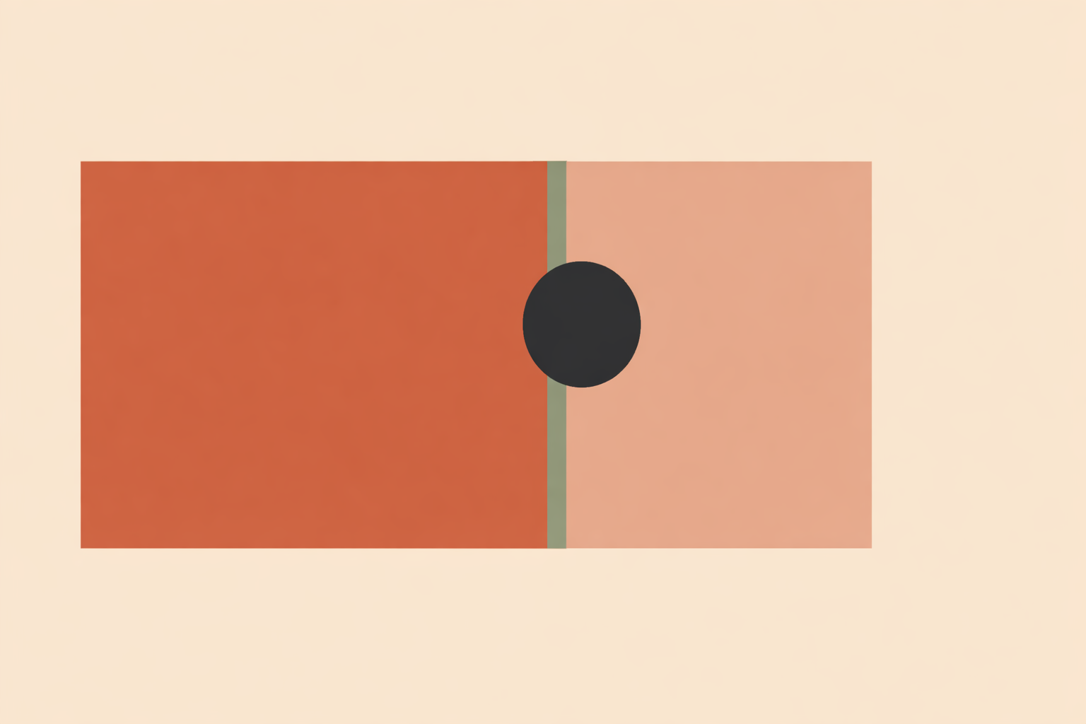
Most client-facing graphics fail in familiar ways: the main message gets buried, the layout feels crowded, or sacred motifs are added as decoration rather than support. Swapping colors or forcing a spiral over everything rarely solves the real issue. What helps is proportion used with intention: to set a clear frame, guide the eye, and create space, with symbolism offered as an invitation rather than a promise.
Key Takeaway: Golden-ratio design works best when it shapes practical decisions. Start with one governing rectangle, use a 62/38 split to establish hierarchy, place the focal point on a phi hotspot, keep type scaling simple, and turn phi into a spacing rhythm. If you bring in mandalas or sacred symbols, place them within that structure and pair them with choice-based language. The goal is not mathematical perfection, but clearer, calmer, more respectful communication.
1. Start with One Golden Rectangle
The most useful way to work with phi is also the simplest: begin with one clear container. A golden rectangle uses the proportion of roughly 1:1.618, and that ratio gives you a steady frame before you decide on imagery, copy, or symbolic elements.
If you like working from real dimensions, choose a familiar width and build from there. For example, a social graphic at 1080 × 667 px lands close to the ratio. Once that outer frame is set, let it guide the rest of the layout so you’re not rebuilding the logic in every section.
This approach supports how people visually take in a composition. One review found a slight overall preference for golden-ratio stimuli in some contexts, and it also suggests phi-based structure can help organize gaze into steadier viewing patterns.
In traditional craft and design lineages, proportion is a practical discipline, learned through repetition and refined taste. Phi fits naturally into that mindset: use it as an armature that steadies the work, then let the piece breathe.
2. Use a 62/38 Split to Clarify Hierarchy
Once your outer frame is set, divide it so one area leads and the other supports. This is where phi becomes immediately useful for real-world communication.
The golden ratio corresponds to a division of roughly 62% and 38%. In practice, your primary message gets the larger field, while supporting details sit in the smaller one.
- Put the headline, key visual, and main invitation in the 62% area.
- Place supporting details in the 38% area.
- Keep the smaller zone clearly supportive, not equally loud.
The exact math matters less than the relationship. One side leads; one side reinforces. That single decision often makes crowded graphics feel calmer.
This also matches what’s seen in research: results are mixed, with no consistent overall preference for golden-ratio photos, yet some phi-based layouts do outperform non-phi versions. In practice, the win usually comes from clearer hierarchy, not the romance of geometry.
3. Place the Focal Point on a Phi Hotspot
With your larger and smaller zones established, choose where the eye should land first. A phi hotspot offers a reliable anchor for that first moment of attention.
Overlay a golden spiral or grid and place your most important element near the tightest part of the spiral or a key intersection. This could be:
- a face or pair of eyes,
- a title lockup,
- a symbol or central motif,
- the start of the visual story.
Eye-tracking work found that fixations clustered in golden-ratio-related areas, suggesting these structures can influence where attention gathers and how it moves across a layout.
If you already rely on the rule of thirds, keep it. Thirds can help you block in quickly, and phi can refine the flow after. Used this way, phi becomes a gentle guide rather than an overlay you have to obey.
4. Keep Type Scaling Simple
The easiest mistake is trying to phi-scale everything. Typography stays clearer when you apply the ratio lightly and consistently.
Choose one body size, then build two or three larger steps from it. If body copy is 16 px, a phi-based scale gives you roughly:
- Body: 16 px
- Subheading: 26 px
- Main heading: 42 px
- Optional caption: 10 px
That’s enough hierarchy for most slides, event graphics, welcome packs, and handouts. After that, let weight, contrast, and spacing do the fine work.
Overusing phi at a micro typographic level often adds fussiness. Many designers use phi as a decision aid, and that’s exactly where it shines: it reduces trial-and-error and gives beginners a steady rhythm to start from.
5. Turn Phi into Spacing Rhythm
If a design still feels tense after the hierarchy is set, spacing is usually the culprit. Phi helps because it turns margins, padding, and gutters into a repeatable rhythm you can trust.
A simple sequence such as 8, 13, 21, 34, and 55 gives you spacing tokens that relate to one another without feeling rigid.
- Use one value for internal padding.
- Use the next step for space between modules.
- Use the largest step for outer margins.
For example, a one-page handout might use 21 px padding inside text blocks, 34 px between sections, and a 55 px outer margin. The composition often feels calmer immediately.
There’s a solid reason orderly spacing feels good to view. Research on processing fluency suggests ease of processing supports more positive aesthetic response. Phi isn’t the only route to that ease, but it’s a practical one.
In day-to-day design work, a phi-based spacing set also reduces tinkering. You choose from a small family of related distances, stay consistent, and keep momentum.
6. Place Sacred Symbols Within the Structure, Then Use Choice-Based Language
Once the frame, hierarchy, and spacing are working, sacred motifs can be added with more care. Let the structure hold the symbol so the symbol doesn’t have to carry the whole layout.
If you’re using a mandala, seed pattern, or other symbolic form, place it intentionally inside the composition. Align the center near a focal hotspot, or let the symbol sit within the 62% primary area while explanatory text stays clearly separate in the supporting zone.
This keeps two languages in relationship without blending them into confusion:
- Craft language: grid, spacing, contrast, hierarchy, alignment.
- Meaning language: balance, interconnection, reflection, centering.
Keeping these layers distinct helps you speak about symbolism as symbolism, with respect for cultural roots and for the viewer’s autonomy, much like sharing shape meanings responsibly in client-facing work.
In client-facing communication, opt-in wording is the most supportive approach:
“If you’d like, you’re welcome to rest your gaze on the center for a few breaths and notice what you experience. If it does not feel supportive today, you can simply move on.”
This protects choice and collaboration. It also keeps your work inclusive for people who relate to sacred imagery spiritually, culturally, aesthetically, or not at all.
7. Blend Phi with Other Composition Tools
Good design rarely comes from one formula applied rigidly. Phi works best when it’s combined with other tools and checked against your own eye.
That matters because the evidence around golden-ratio preference is mixed and context-dependent. For photo composition, research suggests a modest advantage at most over non-phi approaches, and even that varies with subject and framing.
So use phi as a foundation, then refine with what serves communication:
- Block the layout with thirds if that’s faster.
- Refine the flow with a golden rectangle or spiral.
- Adjust type sizes by eye if the exact ratio feels stiff.
- Let readability and tone outrank numerical purity.
Beginners often do best starting with one golden-rectangle foundation because it cascades into better hierarchy, type, and spacing. Once the message reads cleanly, stop forcing the ratio and keep what feels clear.
Conclusion
The real value of the golden ratio is usefulness. One steady frame can lead to clearer hierarchy, stronger focal placement, simpler type decisions, and more breathable spacing. From there, sacred motifs integrate with greater respect, because the composition already has order before meaning is layered in.
Phi is approachable and beginner-friendly when used with restraint. Start with one rectangle, one split, one focal point, and one spacing rhythm, then let those choices support the rest of your design decisions.
As a final note, keep the ethical center intact: respect cultural roots, distinguish tradition from modern invention, and use language that preserves personal agency within spirituality and ritual work. Done well, your visuals feel grounded, coherent, and genuinely welcoming to receive.
Explore Sacred Geometry Certification
Apply proportion with cultural care in the Sacred Geometry Certification.
Explore Sacred Geometry →