

Mid-session, you name what you’re noticing: a clear blue at the throat, a smoky red around the core. The client nods, it resonates, and then the room goes quiet. Do you offer personality labels, a meditation, or one grounded intention for the week? Many practitioners know this moment well. Intuitive insight can feel accurate yet still be hard to translate into a practical next step.
Aura work shines when it’s held as a living pattern you can work with. When colors are read as a changing story, connected to real life themes, and shaped into one realistic objective the client can actually carry this week, the work stays both intuitive and accountable.
Key Takeaway: Aura colors are most helpful when they lead to one clear, measurable next step. A grounded approach is to read colors as dynamic rather than fixed, map them to life themes such as communication or boundaries, adjust goals based on shade and intensity, and revisit patterns over time. This keeps the work practical, client-led, and ethically held.
Step 1: Read Aura Colors as a Dynamic Story
Aura work becomes clearer when color is treated as movement, not a permanent label. In practice, auras are often understood as energy fields around the body that reflect tendencies, present focus, and evolving inner patterns.
Many practitioners also notice that hues shift as attention, relationships, and inner state shift. Biofield literature similarly describes dynamic changes in field coherence alongside stress and psycho-emotional patterns.
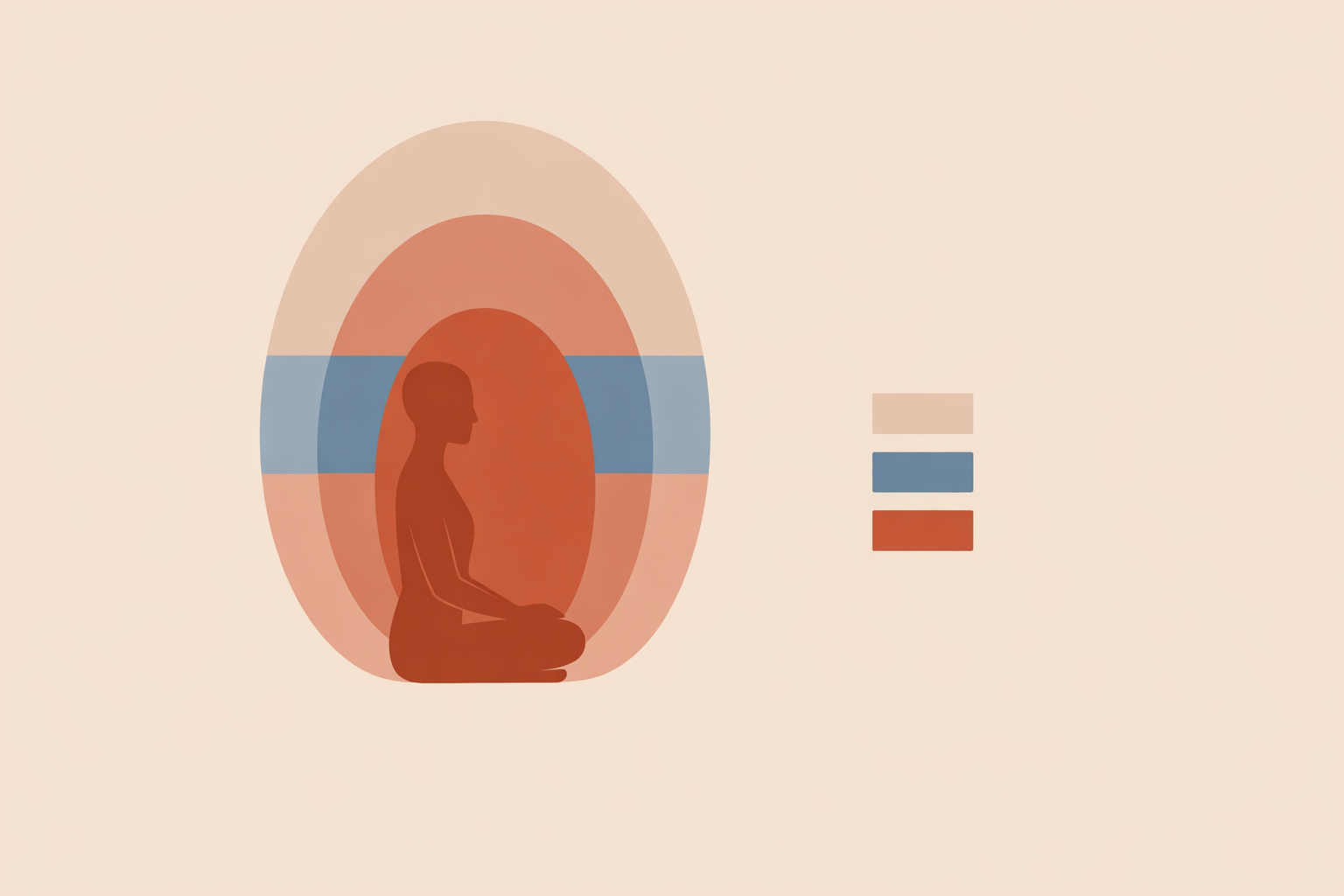
It also helps to read in layers. Many traditions describe the aura as a multi-layered field where physical, emotional, mental, and spiritual aspects interweave, echoing broader descriptions of a complex field involved in ongoing regulation and organization.
Within that landscape, some colors feel like enduring “signature” qualities, while others arrive for a season of pressure, transition, or growth. That distinction is one of the most useful practical lenses for session work because it keeps the reading flexible and client-centered.
Client snapshot: a founder arrives with crisp yellow at the mental layer and hazy green at the emotional layer. Yellow can speak to familiar strengths around clarity and analysis, while green can point to strain around compassion, connection, or replenishment. Once you see it as story rather than identity, the next step becomes easier to shape.
Step 2: Map Dominant Colors to Life Themes
Once you have the story, translate it into a small set of themes you can actually support. This is the bridge between intuitive observation and meaningful coaching action.
In many contemporary traditions, color interpretation overlaps with chakra-based life themes. There isn’t one universal, fixed system, so the most skillful approach is collaborative and light: offer a theme, then check how it lands in the client’s real life.
Many practitioners also read dominant colors as a “home frequency,” with surrounding tones pointing to what’s asking for attention right now. Used as reflection rather than certainty, this can quickly organize a session.
- Blue → expression, truth, communication
- Yellow → confidence, direction, agency
- Green → compassion, relationships, replenishment
- Red → vitality, grounding, drive
- Orange → creativity, warmth, relational flow
- Violet/indigo → intuition, perspective, meaning
Worked example: a client presents with dominant blue and secondary muddied red. Blue can suggest a need for clear expression, while red suggests charge in the system that needs pacing. You translate the blend into one focus: “In next Monday’s meeting, open with one sentence naming the agenda after two grounding breaths.”
Step 3: Use Shade and Intensity to Set the Right Kind of Goal
Color alone rarely gives you enough. Shade, brightness, and texture often show whether the client is ready to activate, stabilize, or restore.
In traditional interpretation, clear and bright colors are commonly read as freer flow. Muddy, fragmented, or overly heated tones are often read as congestion, overdrive, or pressure. These meanings are carried through practitioner lineages, and they’re especially useful for choosing the right pace.
There is also broader support for linking stress with changes in field coherence. Biofield imaging research has described reduced coherence under higher stress, even though it does not validate specific color meanings.
Darker or denser tones deserve careful, respectful framing. A hot red can point to pent-up charge that benefits from regulation before expression. Black is often interpreted as protection or energetic armor during a demanding period. Grey is commonly read as fog or indecision that calls for clearing before pushing ahead.
A simple way to use shade in practice:
- Activation goals: for bright, steady colors that suggest available energy
- Stabilization goals: for muddier or inconsistent tones that call for pacing
- Restorative goals: for dark, dense, or protective tones that ask for reduced load
Scenario: a client shows clear blue around the head but a smoky band at the chest. Rather than pushing toward a high-stakes conversation, start with a stabilizing step like a daily two-minute voice note naming one feeling and one request. As the field steadies over time, the goal can naturally expand into a live conversation.
Step 4: Turn the Reading Into One Clear Objective
The strongest sessions don’t try to do everything. One useful, measurable objective is often enough.
A simple structure keeps interpretation collaborative and grounded:
- Describe what you notice
- Add context about shade, texture, or placement
- Check resonance with the client
- Co-create one observable step for the week
- Measure it in a simple way
In practice, that can sound like this:
- “I’m noticing a bright blue at the throat.”
- “To me, that often relates to expression or honest communication.”
- “The edges feel a little soft, so it may be more about finding the right tone than forcing the message.”
- “How does that land for you?”
- “Would it support you to choose one conversation this week and plan your opening sentence now?”
This keeps the client in the center of meaning-making. The aim is to make the reading useful.
Example: a client’s red feels strong but smoky. You frame it as drive that needs wise containment, and the session objective becomes: “Decline one extra task this week using a kind ‘not now’ script.” Specific steps like this give the session a clean, trackable finish.
Step 5: Create Measurable Goals for Common Aura Colors
Once the meaning is clear, make the goal behavioral. Good goals can be counted, scheduled, or described plainly.
Red: grounding, drive, momentum
- “Three times this week, take three slow breaths before replying to a request, then choose yes or no intentionally.”
- Bright red week: “Complete one 90-minute focus block on your top priority three times this week.”
- Muddy red week: “Aim for four earlier nights and record morning energy from 0 to 10.”
Orange: creativity, pleasure, connection
- “Draft one imperfect idea each day for five days, then share one on Friday.”
- “Schedule one 20-minute conversation this week with someone who feels energizing.”
Yellow: clarity, confidence, agency
- “Choose one top priority by 9 a.m. each day and protect 45 minutes for it.”
- “Delegate one task by Thursday and note how it felt in three words.”
Green: compassion, relationships, replenishment
- “Take two 30-minute walks this week and write one sentence after each about how your chest feels.”
- “Use the phrase ‘I need a moment to think about that’ once this week instead of giving an immediate yes.”
Blue: truth, expression, honest voice
- “Have one honest five-minute check-in before Friday and begin with ‘Here’s what I need to do my best work.’”
- “Record a 60-second voice note each night naming one truth you did not want to avoid.”
Dark protective tones: rest, processing, reduced load
- “Reduce commitments by 10% this week by canceling or rescheduling one non-essential item.”
- “Twice a day for four days, practice a short breathing rhythm and track calm from 0 to 10.”
Composite case: Miguel arrives with bright orange and hazy blue. Week one focuses on creative momentum with one small share. By the next session, blue feels clearer, so the work shifts toward one direct ask in a professional relationship. The color story evolves, and so do the goals.
Step 6: Track Progress Across Multiple Sessions
Aura-based work becomes more grounded when you track it over time. The goal is not to monitor every detail. It’s to see whether the themes, goals, and lived experience are moving together.
Practitioners often observe that colors ebb with mood, environment, and consistent practice. Biofield research similarly suggests that ongoing regulation is dynamic rather than fixed, which supports revisiting impressions across a series of sessions.
Simple tracking is usually enough:
- Start/end ratings: calm, clarity, connection from 0 to 10
- Theme weeks: one week paced action, one week rest, one week expression
- One-line journaling: “Today I honored this theme by…”
- Periodic review: compare color notes with real outcomes like boundaries held, conversations had, or time reclaimed
You can also plan in arcs:
- Weeks 1–2: stabilize smoky red with pacing and rest
- Weeks 3–4: activate yellow through focused action
- Weeks 5–6: support green through replenishment and relational gentleness
- Weeks 7–8: strengthen blue through honest expression
Some practitioners include imagery or aura photography as part of reflection. Aura imaging is recognized as an emerging area; used lightly, imagery can still be a meaningful prompt for conversation and self-awareness.
Step 7: Keep the Work Ethical and Culturally Respectful
Aura work asks for sensitivity. Its usefulness depends on how responsibly insights are shared and how much agency the client retains.
Start with consent before including aura observations, stay within scope, and offer interpretations as possibilities to explore. This is especially important with darker, denser, or emotionally charged impressions, which should never be delivered in a shaming or deterministic tone.
- Consent language: “Would you like to include aura observations today?”
- Scope language: “We’re using this as a reflective tool to support alignment and next steps.”
- Collaborative language: “Keep what fits and leave the rest.”
- Protective framing: describe dense tones as protection, fatigue, or processing rather than as something wrong
It also helps to name cultural roots with care. Color-energy systems draw from multiple lineages and are not universal. Respect looks like acknowledging variation, avoiding grand claims, and inviting clients to relate the work to their own worldview, ancestry, and lived experience.
Let usefulness guide the session: What feels true? What feels helpful? What would support look like this week? That stance protects autonomy and keeps the work grounded in real change.
Conclusion
Aura colors become practical when they shape compassionate, measurable, client-led goals. Read them as a dynamic story, map them to lived themes, adjust for shade and intensity, and choose one step the client can genuinely bring into daily life.
This approach honors traditional insight while staying reflective and evidence-informed. Broader research on biofield therapies suggests promise for stress and well-being when paired with self-report measures, which fits naturally with the kinds of tracking many coaches already use.
As with any subtle work, keep it grounded in consent, cultural respect, and clear boundaries. When aura reading is held lightly and practiced skillfully, it can help clients notice patterns, make clearer choices, and move through change with more steadiness, whether within energy healing practice more broadly or in focused aura therapy work.
Explore Aura Therapy Certification
Build on these goal-setting techniques with structured training in Aura Therapy Certification.
Explore Aura Therapy →