

Crystal work often gets stuck in the same place: turning long lists of meanings into a session that feels clear, coherent, and easy to repeat. Color can be the missing structure. When you use color as the backbone of the session, it naturally guides stone choice, placement, pacing, and the takeaway your client can carry into everyday life.
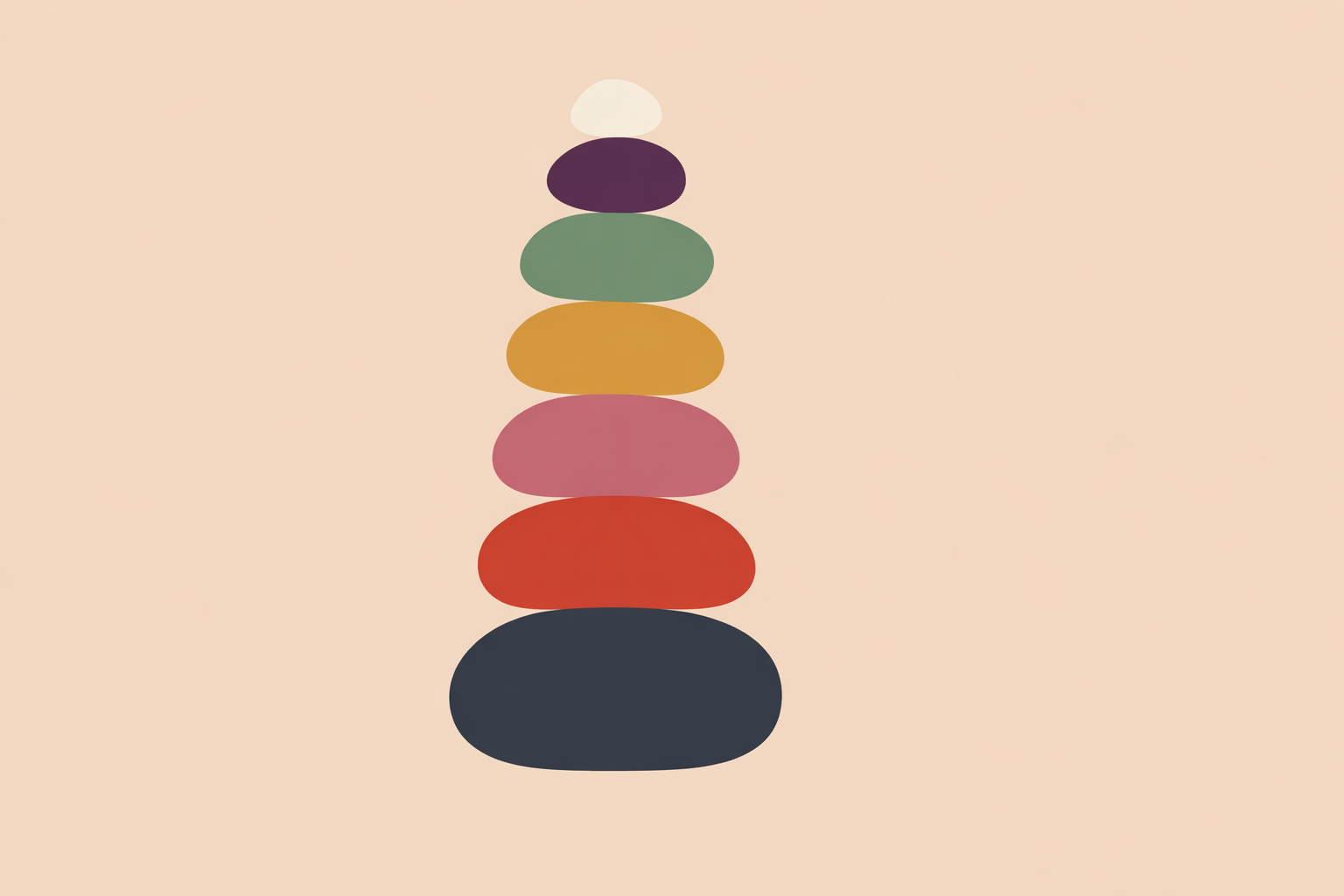
Key Takeaway: Color can act as practical session architecture. A simple progression works well: red and black for grounding, pink for soft heart work, blue for clear expression, yellow or gold for agency, green for regulation, purple for reflective insight, and white or clear stones for framing and closure. The strongest practice is usually the simplest one: one main color theme, a few well-chosen placements, a short time window, and a grounded close.
Grounding Sessions with Red and Black Crystals
When in doubt, begin with steadiness. In many crystal traditions, red and black are the classic grounding colors, and practitioners return to them when a person feels scattered, heavy, or under-contained.
Red brings warmth, weight, and forward presence. Black brings boundary, quiet, and containment. Together, they create a dependable base.
This pairing also fits naturally within traditional chakra-based mapping, where red and black are often associated with the root center and themes of safety, boundaries, and being fully here.
In groups, these colors can also help orient the room. People who need settling often gravitate toward red and black quickly, which makes them useful both in layouts and in how you set out stones.
A Simple Red-and-Black Layout
Keep the structure straightforward. A vertical layout works well when the aim is to restore steadiness and reduce diffusion.
- Set the intention: “We’re restoring steadiness and clear boundaries.”
- Place a red stone at the lower abdomen.
- Place one black stone by each ankle or under the heels.
- If wanted, add a clear stone briefly near the crown to mark the beginning and end of the session.
- Close with three slow exhales and a clear return to the room.
Short, grounded pacing matters here. Stones near the feet, slower breath, and a gentle debrief often do more than adding extra layers.
A simple example might sound like this: “After a draining week, we’ll do a short layout for steadiness—red jasper at the belly for warmth and presence, black tourmaline in the hands or by the feet for boundary, then a slow close before standing.”
Pink Crystals for Self-Connection and Gentle Heart Work
Once there is enough steadiness, pink is often the softest next step. In color-based crystal practice, pink is linked with tenderness, self-kindness, and receptivity, especially when someone wants a gentle way back into feeling.
Pink also shares traditional heart-center associations with green, though the tone is different. Pink tends to feel more intimate and soothing, while green often feels broader and more regulating.
Rose quartz is a common starting stone because it’s approachable and easy to build a simple ritual around. Many clients respond well to pink because it’s emotionally legible: the theme is felt quickly, without needing much explanation.
Heart-centered work benefits from careful pacing. The best sessions here stay consent-based, steady, and responsive to what arises.
A 5-Minute Pink Ritual Clients Can Repeat
If you want a home practice that feels simple and memorable, use a hand-to-heart ritual.
- Hold the pink stone over the sternum.
- Inhale for 4 and exhale for 6 for three rounds.
- Repeat a short phrase such as “I belong to myself.”
- End with one word to carry into the day: “Softness,” “Enough,” or “Warmth.”
In sessions, you can widen the tone by pairing pink with green. Many practitioners find this especially supportive when pink alone feels too tender or emotionally concentrated.
It also helps to offer a portable anchor. A stone can become a small, physical reminder between meetings: slower breath, a kinder inner voice, or a pause before reacting.
Blue Crystals for Calm Expression and Clear Voice
Blue is a natural choice when expression matters, but force doesn’t. In crystal traditions, blue is associated with clarity, truthfulness, calm speech, and a cooler emotional tone, which suits moments where someone wants to say what’s true while still feeling safe.
This is why blue is so often linked with the throat center in chakra-based work. The emphasis is clean expression, not volume or performance.
Sodalite and blue lace agate are common choices. Sodalite often suits sessions that need more structure or thought-clarity, while blue lace agate tends to support softer expression. Very cool blue can sometimes make the field too quiet when someone is already withdrawing, so many practitioners balance it with heart contact or grounding support.
A Throat-Centered Blue Layout
For one-to-one work, a short “speak and soften” structure is often enough.
- Set the intention: “I can speak clearly and stay kind.”
- Place a blue stone at the base of the throat or upper chest.
- Add a pink stone at the heart.
- Place a grounding stone by the feet.
- Ask for one honest sentence about the coming week.
If the voice tightens, soften the structure rather than pushing through. Lower the blue stone slightly onto the chest, lengthen the exhale, and bring attention back to the heart or the feet. Blue tends to work best when it is invited.
Between sessions, a simple color shorthand helps the practice stick: “blue means honest, gentle speech.”
Yellow and Gold Crystals for Agency and Visibility
After grounding, heart, and voice, the next question is often action. Yellow and gold support this shift well. In many color systems, they are linked with confidence, vitality, self-worth, and visible movement in the world.
These tones are traditionally connected with the solar plexus center, where themes of agency, direction, and personal will are commonly placed.
Citrine and tiger’s eye are popular choices here. Citrine often brings a brighter, more expansive quality, while tiger’s eye can feel more structured and practical. The main skill with yellow and gold is dosage: short, clear sessions often land better than long ones, especially when someone already feels overstretched.
These colors translate well into everyday practice because the symbolism is immediate: posture, visibility, choice, momentum, follow-through.
A Short Yellow-or-Gold Protocol
Use this when someone is hesitating, second-guessing, or holding back from a clear next step.
- Set the intention: “I am visible and steady.”
- Place a yellow or gold stone over the solar plexus.
- Put a grounding stone at the feet.
- Ask for one concrete action to take within 48 hours.
- Close by having them say that action aloud in one simple sentence.
This color family works best when the session ends with commitment rather than reflection alone. Yellow tends to want movement.
Green Crystals for Regulation, Balance, and Integration
Green is often the great balancer. After a more activating session, many people want a color that widens the field again. In crystal traditions, green is associated with renewal, balanced growth, replenishment, and a steadier emotional rhythm.
Like pink, green is often linked with the heart center, but its feel is different. Pink tends to gather attention inward; green often creates more space around the feeling, which makes it easier to stay present without getting pulled under.
Aventurine, jade, and malachite are often used here, each with its own tone. Aventurine tends to feel accessible and buoyant. Jade often brings a grounded, even-tempered quality. Malachite is usually approached with more respect and selectivity, especially when exploring deeper patterns and the person has enough inner resources for that level of work.
Many practitioners lean on green when they want emotional contact without overload. It often helps a session breathe.
A Green Layout for Regulation
When the aim is balance rather than intensity, keep the arrangement spacious.
- Place a green stone at the heart.
- Place a second supportive stone at the lower belly.
- If useful, add a clear stone briefly above the body to organize attention.
- Use a slow breath: inhale to the heart, exhale toward the belly.
- Close with a grounding stone at the feet before standing.
This kind of layout can be especially kind in times of transition, fatigue, or emotional fullness. Green rarely needs a dramatic script; it often works through a quieter shift into “enough space.”
Purple Crystals for Reflection and Inner Awareness
Purple belongs to sessions that are less about doing and more about seeing. In traditional color-based crystal work, purple is associated with reflection, subtle awareness, insight, and a wider inner view. It often suits someone who feels steady enough to observe patterns without being overtaken by them.
This is why purple is commonly linked with the brow or third-eye center, and why violet or white may be brought in near the end when the intention is perspective rather than activation.
Amethyst is the classic starting point. Lepidolite is also often chosen when the overall tone needs to stay softer. Upper-center work benefits from balance, so practitioners often shorten the time window, keep a strong grounding stone at the feet, or pair purple with heart contact to keep the session embodied.
A Grounded Purple Practice
For insight work, simplicity protects the session.
- Place a purple stone at the brow.
- Place a heart stone at the chest.
- Place a grounding stone by the feet.
- Ask: “What am I noticing, without fixing it?”
- End with one minute of journaling or a single spoken reflection.
That final step matters. A brief note, image, or sentence helps bring the insight back into ordinary life, where it can actually guide choices.
White and Clear Stones for Framing and Closure
White and clear stones are often best used as support rather than as the whole session. In many traditions, they are associated with clarity, spaciousness, and integration. Clear quartz in particular is commonly used to unify or amplify the intention already present in the layout.
Because these stones also connect symbolically with upper-center themes, many practitioners use them briefly and deliberately. A short placement at the beginning can frame the work. A short placement at the end can gather the threads and signal closure.
Clear stones are especially useful when multiple colors are present. They help the layout feel like one coherent conversation.
A Clear Closing Sequence
At the end of almost any color-led session, a simple closure works well.
- Remove stones gradually, often from the upper body downward.
- Leave a clear or white stone briefly as the final point of stillness.
- Invite two or three slow exhales.
- Name one word or phrase to carry forward.
- Return attention clearly to the room, the chair, the floor, and the next part of the day.
In group work, clear stones can also create a shared finish. Passing one stone around the circle and inviting each person to name a single word is often enough.
Using Color as Session Architecture
The deeper skill is learning how to build one clean session around one dominant theme. Red and black settle. Pink softens. Blue clarifies. Yellow and gold mobilize. Green regulates. Purple supports reflection. White and clear gather and close.
That progression gives you a practical decision map for one-to-one work, group facilitation, and home practice. You start with the tone you want, then let color narrow the options.
As a rule of thumb, one color theme at a time is usually enough. Add one complementary support if needed, keep timing contained, and close well.
It is also worth naming the knowledge base honestly. Much of what we know in this area comes from traditional use and practitioner observation, with limited strong empirical research. That does not make the work meaningless; it simply asks for integrity. Stay within a clear well-being and coaching frame, listen closely to how the person responds, and let simplicity lead.
Go Further in Lithotherapy
Deepen your color-led crystal sessions with the Lithotherapy Certification.
Explore Lithotherapy Certification →