

Most practitioners spend hours refining their message and only minutes shaping the first slide. Yet the room responds before you speak. Heads tilt, note-taking pauses, and you can feel a subtle pressure to prove yourself. Often, what’s missing isn’t better content. It’s a steadier frame.
A clear visual structure signals care. Consistent spacing, calm hierarchy, and one obvious focal area help people relax into your guidance. When attention is scattered, the audience has to work to find the point. When the layout carries the point, they can follow with ease.
Key Takeaway: Golden-ratio composition works best as a calm visual scaffold, not as a mystic promise. A practical 62/38 layout can create breathing room, support hierarchy, and help symbolic elements sit more gracefully within a slide. Used lightly, it can strengthen trust, clarity, and presence. Used rigidly, it can do the opposite. The most trustworthy approach pairs proportion with accessibility, restraint, and language that leaves room for personal meaning.
How slide structure shapes trust before you speak
People form visual judgments extremely quickly. Research suggests first impressions of design quality and trust can arise almost immediately, before the content is fully processed. So your first slide is already telling the room whether you feel grounded, organized, and considerate.
Proportion matters because it helps people know where to look. A stable layout reduces visual friction, and that ease is often experienced as confidence in you.
In real session-style teaching, a divided layout with one main field and one support field usually lands better than a slide where everything competes. One feels composed; the other feels like effort.
In sacred-geometry spaces, expectations can run high. A grounded frame communicates something mature and balanced: symbolism is welcome, and clarity still leads.
Using the golden ratio as a practical layout tool
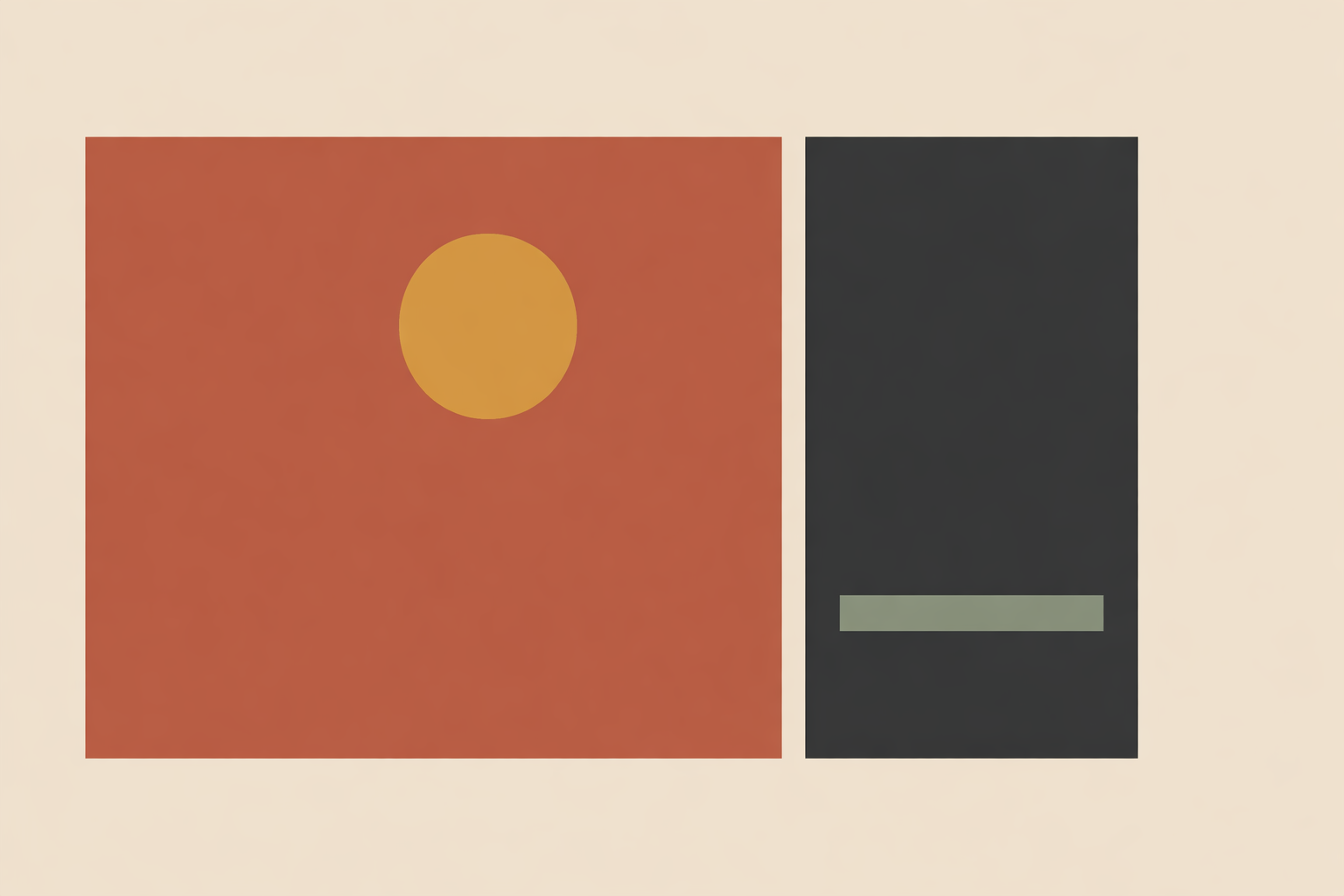
The most useful way to work with phi is as a dependable proportion for organizing space. Many practitioners use a simple 62/38 split: the larger area carries the central idea, while the smaller area holds supportive context.
That alone can shift the feel of a slide. The main field gives your message room to breathe, and the support field holds detail without letting it take over.
Phi also doesn’t need to be sold as the only “best” proportion. Reviews of visual-perception research have found no special advantage for golden-ratio proportions over other simple proportions in basic geometric forms. Another review similarly reported no clear preference for golden-ratio configurations.
Traditional symbolic systems can still hold phi as meaningful—growth, unfolding, harmony—while design practice treats it as a clean scaffold. Both uses can coexist without exaggeration.
Building a clear 62/38 slide frame
Start with one large field and one smaller field. Let the 62% area carry your core promise, headline, or image. Let the 38% area carry one supporting cue.
This divided structure tends to feel trustworthy because it creates order. In a widely cited credibility study, design issues were central to why users distrusted websites, with 94% of mistrust comments relating to design factors.
Slides follow the same human logic: clear hierarchy feels respectful. Visual order also shapes early trust judgments, especially in the first moments of viewing. Reusing the same grid across a deck builds familiarity, which helps your audience settle in.
- Put the main promise in the larger field.
- Keep the headline readable in one glance.
- Use the smaller field for one confirming detail, not three.
- Let margins stay open rather than filling every edge.
A simple slide might place “What shifts in four weeks” in the larger field with one photo or symbol. In the smaller field, you might add “one focus, one rhythm.” The support area confirms the message rather than competing with it.
Guiding attention with spirals and sacred forms
Once the frame is stable, you can add movement. Spirals, mandalas, or seed patterns can help, as long as they stay in service to the message.
A spiral creates a gentle viewing path: where the eye enters, where it pauses, and where it resolves. A practical approach is to place the focal element near the tighter part of the curve and let the rest of the slide open around it.
Mandalas and related forms tend to work best when they’re integrated quietly. If they dominate, they become decorative noise. If they sit inside a coherent proportion system, they often feel anchoring.
A steady rule works well: geometry should support orientation, not demand attention for its own sake. If people mainly register calm and coherence, it’s doing its job.
Sensitivity matters, too. Some spiral visuals can feel intense or tunnel-like for certain viewers. Softer contrast and slower visual pacing help, and optional language keeps the experience spacious. A phrase like “If it feels supportive, let your eyes follow the shape” invites engagement without pressure.
Holding symbolism and evidence with honesty
How you speak about phi matters as much as how you place it. A proportion can clarify a slide, but the story around it can either build trust or inflate expectation.
It helps to speak in two languages at once: symbolic language for those who value meaning, and practical language for those who want immediate clarity. This respects tradition and respects the viewer’s autonomy.
- Practical language: “I am using a divided layout so the main point is easier to locate.”
- Symbolic language: “Some people also experience this proportion as a pattern of balance or unfolding.”
This keeps the atmosphere open. It doesn’t force belief, and it doesn’t flatten lineage. The geometry stays meaningful without becoming a claim that must fit everyone.
The same tone works well with mandalas and similar forms. Offer the possibility, then let personal experience lead. Choice tends to build more trust than insistence, especially in spirituality and ritual spaces.
When golden-ratio design backfires
The main risk with phi isn’t aesthetics. It’s rigidity. When proportion becomes dogma, clarity usually drops.
This shows up as overbuilt slides: too many overlays, too many symbolic forms, too much effort spent forcing every block into a ratio. The result can feel strained rather than calm. In practice, most designers do better when they use proportion lightly and keep the message in charge.
Ease of reading still drives trust. Designs that are easier to process are more likely to feel trustworthy, while crowded layouts tend to do the opposite.
Accessibility comes first. If a beautiful proportion leads to faint text, cramped copy, or weak contrast, it has missed its purpose. Accessibility guidance prioritizes legibility over aesthetic systems.
- Use one main proportion, not several competing ones.
- Cut text before shrinking type.
- Choose contrast and readability over visual theory.
- Remove any sacred form that pulls attention away from the point.
If a slide feels busy, the fix is usually subtraction. Keep the headline. Keep one image or one symbol. Move the rest into the support field or onto the next slide.
A trust-first workflow for sacred-geometry slides
A reliable process beats chasing perfect proportions. Start with the message, then let geometry support it.
- Set the frame with a large field and a smaller support field.
- Place the core message where the eye finds it immediately.
- Add one supporting detail only after the hierarchy is clear.
- Bring in a spiral or sacred form only if it improves flow.
- Check contrast, text size, and spacing before refining aesthetics.
- Use language that leaves room for both symbolism and personal choice.
- Review the slide at a glance: what lands first, and does it match your intention?
Across a full deck, consistency matters. Repeating a coherent grid, color rhythm, and spacing logic gives the audience less to decode. Cohesive visual systems help strengthen brand trust because order reads as care.
In the end, sacred geometry supports presentation design best when it stays quiet and practical. The slide feels calmer. The message arrives more clearly. And the room senses your steadiness before you have to explain it.
Explore Sacred Geometry Certification
Apply calm, trustworthy proportion with the Sacred Geometry Certification in your teaching and design choices.
Explore Sacred Geometry →