


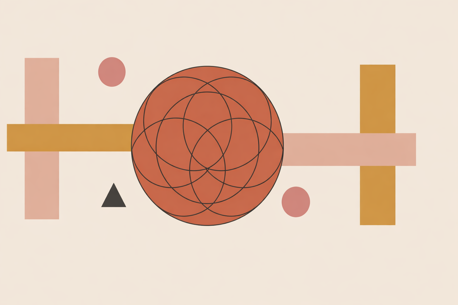
A client asks for a sacred geometry poster that radiates harmony, and it’s tempting to open the drawing app immediately. Yet geometry-heavy projects rarely go sideways because the construction is weak. They get difficult when meaning, scale, and print realities were never settled. The smoothest path is to define those first, then draw with real intention.
Key Takeaway: Reliable sacred geometry print work begins before the first circle is drawn. Clarify what the client means, decide final size and viewing conditions, keep the geometry in vector where possible, prepare color for print rather than screen, protect edges with bleed and safe margins, test line weights at real size, and finish with a careful preflight and respectful interpretation notes.
1. Turn “sacred geometry” into a clear brief
When a client says they want something harmonious, symbolic, or sacred, your first job is translation. A strong brief keeps the spirit of the work intact while turning it into decisions you can actually build and print.
Start with the practical frame:
- What is the piece for, and who will encounter it?
- What are the final dimensions and orientation?
- What surface will it be printed on?
- How will it be displayed, and from what distance?
- Will the artwork also need digital versions?
- What is the timeline for proofs and approval?
It helps to speak in two languages at once: production language for accuracy, and plain language for shared understanding. “Bleed: 3 mm” becomes “extend the artwork past the cut line so it trims cleanly.”
Next, clarify what “sacred geometry” means to them. Sometimes they want a known diagram; sometimes they want symmetry and proportion; sometimes the “sacred” part is personal symbolism rather than a historic form.
A quick meaning audit keeps everyone grounded:
- Measurable form: constructions, ratios, grids, symmetry, radii, angles
- Historic use: motifs or diagrams with documented cultural context
- Personal meaning: the client’s own interpretation or intention
This is where respectful practice begins. You don’t need sweeping claims for a design to feel potent. It’s enough to name the visual tools—proportion, repetition, symmetry—and let meaning meet the viewer without forcing a single story.
2. Fix final size and viewing scale before adding detail
Before refining petals, lattices, or halos, lock the final size. Scale quietly decides line weight, spacing, legibility, and how dense the geometry can be before it becomes visually “tight.”
When possible, build the artwork at 100% final size. For most general print jobs, 300 dpi at final dimensions is a practical target. Bitmap line art with delicate details may need around 1200 dpi to stay crisp.
Large-format pieces can often use lower resolution because they’re viewed from farther away. Distance changes what details the eye can truly resolve, which matters for banners, lobby graphics, and large display prints.
Designing a 24 × 36 inch poster versus a 5 × 7 inch card is not just “scaling.” A nested pattern that feels rich at poster size may turn congested on a smaller print, and a motif balanced on a card can look sparse when enlarged.
Useful brief notes at this stage might include:
- Primary construction circle diameter
- Minimum visible gap between rings
- Smallest symbolic element that must remain legible
- Expected viewing distance
These decisions save time because they prevent you from lovingly building details that won’t survive the final object.
3. Keep the geometry scalable with the right file structure
Sacred geometry depends on precision, so file structure matters. In most cases, keep the geometry itself vector.
Vectors are ideal for circles, polygons, lattices, rosettes, spirals, and symmetry because they can scale without losing clarity. That also means preventing pixelation and keeping proportions exact.
Raster elements still belong in the process when they add warmth: textured scans, painted washes, grain, or hand-drawn overlays. The key is timing. Keep the construction editable as long as you can, and only rasterize when the output truly calls for it.
This is also the moment to name your proportion system in your working notes. If you’re using a golden rectangle, a logarithmic spiral, a modular grid, or another armature, document it clearly as part of your sacred geometry process. Even if the client never sees those layers, building from a stated structure strengthens the final piece.
4. Prepare color and gradients for print, not just screen
Sacred geometry often leans on luminous transitions and centered light effects. Those can look effortless on a monitor and feel flatter on paper if the workflow isn’t set up for print early.
Many print workflows require CMYK or grayscale rather than RGB. Screen color is light; print color is ink interacting with the surface. Some shift in brightness or hue is normal, so plan for it.
Gradients deserve extra care because large smooth transitions can show banding. Using a broad tonal range rather than a narrow mid-range ramp often reduces the risk.
Many designers also add subtle texture or noise to help gradients print smoothly, especially when soft halos or radial fields carry the composition.
A simple workflow looks like this:
- Convert or build the palette with print output in mind
- Test key colors on the intended stock where possible
- Check gradients for dulling or visible stepping
- Adjust endpoints before final proof approval
When color has symbolic weight for the client or their community, a printed proof is worth the time. It keeps the conversation anchored in the real object, not the glow of a backlit screen.
5. Protect borders, circles, and halos at the trim edge
Edges are where elegant geometry can lose its calm. A trimmed mandala can feel “off” fast if borders sit too close to the cut, or outer rings aren’t planned for real-world trimming variance.
Most print setups require 0.125 inch bleed beyond each trim edge. It’s also wise to keep important elements comfortably inside the final edge.
This matters even more for sacred geometry than for many other styles. A circle can be mathematically centered and still feel visually damaged if the trim takes a little more on one side. Thin outer halos, repeated border lines, and near-edge text are especially vulnerable.
A dependable setup for a square mandala might look like this:
- Create the artboard with full bleed included
- Extend all background color and outer glow fully into the bleed
- Keep thin circular borders well inside the trim
- Check that the visual center still feels calm and intact
One quick review with only three guides visible—trim, safe zone, and bleed—catches a surprising number of avoidable problems.
6. Test line weight and spacing at real size
Geometry can look perfect at 400% zoom and still fail on paper. Fine lines can break, inner petals can merge, and repeated patterns can start to “vibrate” against themselves. The fix is threshold testing at actual size.
If your print partner can provide minimum line guidance, use it, then validate it with your own small test. A simple chart with a few stroke weights, a few gap widths, and repeated circles or lattice shapes will tell you what the paper and process can hold.
This is especially useful for:
- Concentric circles: where tiny interior gaps can close up
- Rosettes and petals: where overlap can muddy the center
- Dense lattices: where repeated spacing can create visual interference
- Tiling systems: where the whole image can gray out if negative space is too tight
Dense line patterns also respond well to small spacing adjustments. Opening the rhythm slightly is often enough to reduce moiré or visual tension in repeated structures.
If a flower-of-life pattern feels clear only at 200% zoom, it isn’t ready for print. Print it at actual size, find where it closes up, then widen gaps or strengthen strokes until the form breathes.
7. Preflight carefully and hand off with clear context
The final stage is both technical and relational. A clean handoff protects the work, reduces back-and-forth, and helps the client share the piece responsibly.
Before export, run a disciplined preflight check:
- Final page size and orientation
- Bleed and trim setup
- Safe spacing for essential elements
- Raster resolution at final dimensions
- Vector integrity
- Fonts embedded or outlined
- Color mode and profile
- Transparency and overprint review
- Spelling, symmetry, and alignment
- Proof approval status
Then prepare a handoff bundle that’s easy to use:
- Press-ready PDF
- Editable master file
- Flattened preview image
- Color notes where relevant
- Construction notes for the geometry
- Version and approval record
If the design draws on a named tradition, include a short interpretation note that stays accurate and non-appropriative. You can describe the piece as an exploration of symmetry, repetition, and proportion, while acknowledging that meaning varies across people and cultural contexts, which is especially important in spirituality and ritual work.
This matters because symbolism travels quickly. Once a design leaves the studio, it may be reposted and reframed far beyond its original setting. Clear notes help protect the integrity of the artwork and the cultural roots it may touch.
Conclusion
Sacred geometry print work asks for steadiness: clear briefing, honest construction, thoughtful production choices, and respectful language around meaning.
When you decide structure before detail, keep geometry scalable, prepare color for print, protect the edges, test the smallest visible thresholds, and close with a careful handoff, the finished piece holds together gracefully. What reaches paper is a coherent offering, built with skill and shared with care.
Explore Sacred Geometry Certification
Deepen your practice by grounding sacred geometry design choices in the Sacred Geometry Certification.
Explore Sacred Geometry →