


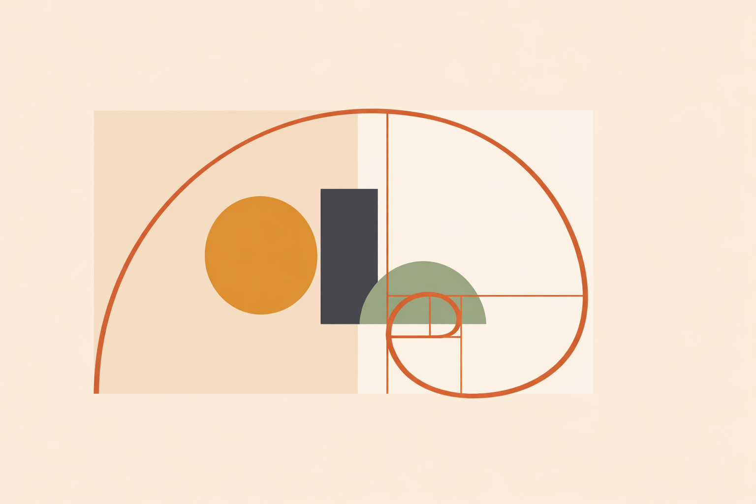
When a client asks you to “use the golden ratio so the design feels harmonious,” the most helpful response sits between automatic agreement and hard dismissal. In practice, φ works best as one organizing tool among many: meaningful in some projects, distracting in others, and never a guarantee of beauty, clarity, or ease of use.
Key Takeaway: Treat the golden ratio as an optional armature, not a universal rule. It can offer a shared visual language and sometimes support hierarchy, but evidence for a broad preference is limited and context-dependent. Used well, φ can sit alongside other proportional systems; used rigidly, it can interfere with responsiveness, readability, and accessibility.
Why clients are drawn to the golden ratio
Clients reach for the golden ratio because it carries cultural weight. It signals harmony, sophistication, and a sense of timeless order, so expectations can form before any sketching begins.
Design folklore often frames φ as a special “beauty code,” even though broader reviews describe weak evidence for a universal preference. The attraction is genuine; it just isn’t the same thing as proof.
For practitioners, the sweet spot is to respect the symbolism while staying practical. φ can be resonant and still deserve the basic question: does it serve this audience, this message, and this moment?
What the golden ratio is in practical terms
The golden ratio is a proportion: φ ≈ 1.618. It describes a relationship where the whole relates to the larger part as the larger part relates to the smaller.
From that idea, a few common tools show up in day-to-day design work:
- Golden rectangle: a rectangle with sides in a 1:1.618 relationship
- Golden spiral: a drawn spiral based on subdivisions of a golden rectangle
- Fibonacci sequence: a number series whose ratios approach φ over time
Designers often like the golden rectangle because it repeats itself: remove a square and the remaining rectangle keeps the same proportion. That makes it a practical armature for exploring layout, cropping, and scale.
The spiral deserves a clearer framing. The familiar design overlay is a diagrammed approximation, not a universal curve that cleanly “maps” onto everything in nature.
Fibonacci sequence-based spacing and type scales can still be useful because stepped systems are easy to apply consistently. That usefulness is craft-driven, not evidence that φ outperforms all other proportions.
In practice, you’ll also round. If an image is 1000 px wide, a golden-rectangle height is about 618 px, but a tidy 620 px might implement more cleanly. The ratio can guide decisions without ruling them.
What evidence says about beauty and preference
The most reliable takeaway: the golden ratio is not universally preferred, and any preference that appears is usually modest and dependent on context.
Large reviews push back on sweeping claims that most people automatically find φ-based compositions more beautiful. Broad statements of universal appeal lack support.
More focused work points the same way: preference tends to be modest and contextual. Sometimes people respond well; other times there’s little difference.
That context-sensitivity shows up in layout research too. One reported experiment found a preference for advertisement compositions, while the same preference didn’t reliably carry over to simpler shapes and patterns. The content and the viewing task matter.
For working designers, this is liberating. φ becomes something to test and compare, not something to obey. If the layout feels balanced, keep it. If it feels forced, choose a different structure.
Myths, monuments, and the urge to find φ everywhere
Golden ratio stories can be compelling because they connect design to lineage and mystery. That sense of reverence can be valuable, as long as it doesn’t drift into overclaiming.
A classic example is the claim that monuments “prove” φ. Reviews of these arguments suggest that measurements are often chosen after the fact, and irregular structures make that easy. Changes through restoration, viewpoint, and selective measuring can all make φ look more present than it is. In that sense, monuments often end up supporting speculative measurements rather than firm conclusions.
None of this diminishes traditional geometry. Many lineages work deeply with proportion, symmetry, repetition, and pattern as living practice, often using whole-number ratios, simple fractions, and culture-specific rules rather than a single constant.
Holding that wider view is more respectful to tradition. It honors proportion as relationship, without compressing diverse histories into one number.
When the golden ratio can genuinely support a project
The golden ratio helps most when it provides structure without turning into dogma.
It tends to be useful when you want:
- a starting armature for composition
- a shared language for balance and hierarchy
- a repeatable proportional system across related assets
- a symbolic frame that matters to the client or audience
In a brand system, a golden rectangle can offer a calm starting frame for arranging a mark, wordmark, and supporting text. In editorial layouts or posters, a spiral overlay can help you check whether attention moves toward the intended focal area. In contemplative or mandala-based visual work, spiral structures can support a sense of motion and spaciousness when used lightly within spirituality and ritual practice.
Flexibility is the skill. You might start with a 1000 × 620 canvas, place the key image in the larger field, and use the remaining area for headline and call-to-action. If it breathes, develop it. If it starts to feel contrived, adjust the grid or move on.
That’s a mature relationship with sacred geometry: grounded, intentional, and responsive to the work in front of you.
When the golden ratio gets in the way
Problems show up when φ stops supporting content and starts controlling it.
Common warning signs include:
- responsive layouts that feel awkward across breakpoints
- text blocks with uncomfortable line lengths
- dashboard or data views that become harder to scan
- captions, controls, or touch targets compressed to preserve a ratio
- multilingual layouts that become harder to set cleanly
In real client work, those trade-offs matter more than the elegance of an armature. Often a modular grid adapts better to shifting content, and root-two or column systems translate more smoothly across print and digital environments.
Accessibility should outrank proportion every time. If keeping φ makes type harder to read, interaction harder to use, or the layout harder to follow, the geometry is no longer serving clarity or well-being.
One practical uncertainty is worth naming: we still don’t have strong evidence about how φ-based layouts land for neurodivergent or sensory-diverse audiences. That’s a reason to test carefully with real users and let results lead.
How to test the golden ratio with clients
If a client values the golden ratio, lean into comparison instead of debate.
Create three versions using identical content:
- Option A: a φ-based layout or spiral armature
- Option B: a simpler modular or thirds-based system
- Option C: a freer composition shaped by hierarchy and content flow
Review them through realistic tasks, not taste alone. Ask people to find key information, compare choices, or complete a simple action. Watch what gets noticed first, what feels calm, and what supports orientation.
Useful prompts include:
- “Where did your eye go first?”
- “What felt clear?”
- “What felt cramped or confusing?”
- “What would make this easier to use?”
Keep feedback clean by not announcing which option uses φ. Once a layout is labeled “special,” expectations can shape what people report.
Afterward, sort what you learned into four buckets:
- Measurable: what people found faster, understood better, or used more easily
- Historical: what is truly documented in a tradition and what is not
- Interpretive: what symbolism the design may evoke
- Promotional: what claims sound appealing but are not well supported
This keeps the conversation respectful: symbolism gets honored, and performance still gets taken seriously.
Using sacred geometry with integrity
Sacred geometry deserves better than cynicism or hype. The golden ratio can be beautiful, useful, and meaningful, and it can also be overfitted when it’s asked to do the job of judgment and craft.
A grounded practitioner treats φ like any beloved tool: with care, context, and restraint. Sometimes it offers a graceful structure; sometimes another proportion will carry the work more naturally. Both outcomes can still respect tradition.
To build trust, stay clear about categories. Name what is symbolic. Name what is measurable. Test when the stakes are practical. Keep a little caution for the end: avoid rigidly preserving φ when it compromises responsiveness, readability, or accessibility, and be especially thoughtful when designing for diverse sensory and cognitive needs.
Explore Sacred Geometry Certification
Deepen these proportional insights with the Sacred Geometry Certification for grounded, integrity-led application.
Explore Sacred Geometry →